“Before you leave, checkout our special offers!”
8 out of 10 times you must have seen such pop-up messages just as when you were about to exit a web page. Isn’t it?
Don’t you think it’ a smart way to lure customers again and prompt them to purchase the product?
If not, you should. These kind of popups works most of the time. And, this is one of the major tactic used by companies to increase their sales.
As these popups are shown to the visitors when they are about to leave the site, they are called Exit Popups.
What You’ll Learn?
- Definition and need of Exit Popups / Exit-Intent Technology
- Proof why exit popup works
- Science behind working of exit popup
- Top 5 applications of exit popups
- Do’s and Dont’s with exit popups
- Top 10 exit popup WordPress plugins
- Alternatives to exit popups
- Steps to create exit intent popups / optins
- Conclusion
What are Exit Popups /
Exit – Intent Technology?
Before we introduce exit popups / exit -intent technology, let’s look at some of the top reasons that are responsible for your website or shopping cart abandonment.
Top 5 reasons of cart / website abandonment rate
- Visitors don’t find your content relevant
- They get distracted or their browsing gets interrupted with unnecessary messages
- Visitors find your website difficult to navigate
- They were researching and weren’t yet ready to commit.
- The product price didn’t suit their budget
Owing to the above reasons and some others, the abandonment rate of websites may reach a sky-high limit sometimes, resulting in very high bounce rates and poor sales.
That’s where, exit popups becomes your hero.
Exit-Intent Popups – The Saviour
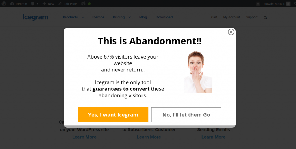
In technical terms, exit intent technology is the one which keeps a track on the mouse movements of website visitors and detects when a visitor is likely to leave the website without taking any action.
At this juncture, the exit popup will be triggered displaying an irresistible offer message or a resource to prevent that visitor from abandoning your web page or shopping cart; further encouraging him to go ahead and make a purchase.
Hence, an exit popup, exit overlay (full-screen popup) or exit intent technology is the best way to lure a visitor / potential customer when he is just about to exit.
Isn’t this what the smart salespersons do in shops? They offer you a last minute special deal or discount that makes you rethink your stand.
You can do the same using exit popups on your WordPress site.
Proof – Exit Popup is a Magic Tool
Exit Pop-ups work because they help increase conversion rates. As simple as that.
Here are some real-life exit pop usage examples:
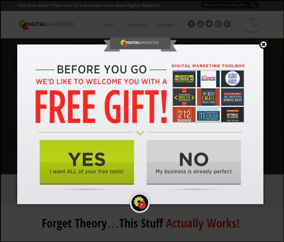
DigitalMarketer.com was able to generate a massive 2689 leads in 14 days using exit-intent popups. Not only did they increase their leads count, but were also able to decrease the bounce rate, increased the time spent by visitors and increase their sales as well.
Another example is of TheCanvasFactory website.
They started an exit overlay campaign, which proved successful in
converting 13.51% of the abandoning visitors into email subscribers over a period of 60-days.
That’s about 135 new email signups for every 1000 literally lost visitors.

Spork Marketing, a dealer for Toyota auto parts and accessories, generated a 54% increase in call volume through its exit popup strategy and eventually increased monthly revenues by a full 15%.

Pretty impressive stats, aren’t they? Nothing less than magic.
Why Exit Pop-ups Work?
Exit popups got a science behind it and is backed by human psychology that studies the consumer behavior and the impact of various stimuli on their mind and decision taking ability.
Simplifies Decision Making
If you’ve plenty of options in hand, they only create anxiety and confusion. Same applies if you have a few choices as well.
Exit overlays saves you from information overload and help clear away the background noise. After going through all the product information and considering all the aspects, you reach a stage of decision fatigue.
And, when you are about to leave, your tired mind is lured with a simplified solution. As by this time your willpower is reduced, you’re most likely to fall for the temptation.
Gives Another Opportunity
When the web page fails to engage you, an exit-intent popup helps to change the subject by diverting your attention to something else and then refocuses on your desired outcome by making an irresistible offer that convinces you or makes you rethink about abandonment.
Exit intent pop-ups also help take the visitor to a new page, which means the visitor spends more time on the site, and you get more time to convince the visitor.
Here’s your opportunity to reinforce your message. As it happens, the more the message is repeated or reinforced, the better are the chances of the visitor taking the desired action.
Top 5 Applications of WordPress Exit Popup – Offers, Lead Generation..
In addition to holding back visitors from leaving, exit popups serves a variety of purposes. Let’s have a look at some of the top ones:
1. Building email list
When you offer visitors relevant content or a promise or some secrets, it arouses interest amongst them and they happily sign-up for it.
In the below example of exit overlay, Neil Patel asks you to sign-up for a webinar in which Neil will show you the simple tactic he used to get the top spot in online marketing.
A clear message, pretty convincing. I would have sign-up. Would you?

2. Creating scarcity and urgency
Whenever a person abandons the cart, you can trigger a popup highlighting about the offer like – last few items left in stock, this offer won’t get repeated, last few hours for sale end, etc.
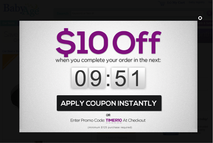
In the example below of BabyAge e-commerce shop, you get $10 OFF when you complete the order within 9 minutes, 51 seconds using the coupon code.
This creates an urgency among the audiences prompting them to make a purchase at the earliest.
3. Offering resources – tutorials, ebooks, freebies, video, etc.
If visitors leave your site, offer them a valuable resource – an e-book or a video guide or link to relevant content. This will make them rethink on their decision of leaving empty-handed.
In the example shown below, Brian Dean, The SEO Expert, tells readers that it’s possible to get 25,000 visitors a month and offers a detailed guide (tutorial) to show them how..
Again, a clear cut message that encourages visitors to sign-up instantly.

4. Taking feedback / surveys
If you are facing troubles in dealing with high bounce rates, this exit popup is your way to go.
Ask for a feedback of your visitors / customers before they leave as shown below. This will let you know some of the major reasons why visitors leave your site.

5. Introducing new products / services
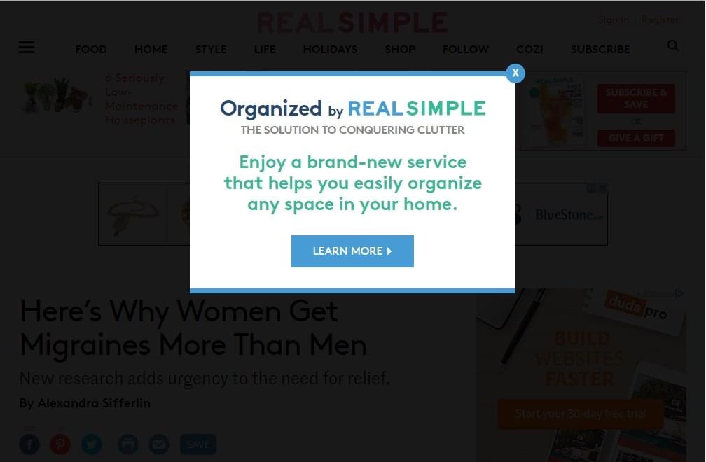
You can make use of exit intent technology to inform visitors about a new product or service.
And also if you have tweaked any changes in the existing range of materials and made it more innovative than competitors, this popup suits the best for you.
This quickly interests the visitors and makes them explore more about your product or service.
There can be a number of ways you can use exit overlays to attract visitors from the above interchangeably like:
- Offer a discount when customers follow you on social media
- Give freebies, demo of your product
- Issue discount coupons and vouchers on customer’s next purchase
- Display contest / competition forms
- Update subscribers about new blog posts
and many more..
In an exit popup, you can display simple text, images, videos, forms, or just anything that serves your conversion or marketing purpose in different styling and personalised design layout.
Exit Popups Do’s and Don’ts
Please do not get too carried away and drown yourself in overconfidence thinking that exit popups will always work no matter what you do.
There are some caveats. As with everything else, some actions that bring desired results and a few practices may be counterproductive or produce adverse results.
Exit Popups Do’s
Take care of colors
You can highlight text in red or use a red colored callout to capture the visitor’s attention. Or, use indicators like plain or animated arrows to direct the visitor to where you want to take them and reinforce your message.
Remember F-shape pattern
Research shows that people make an F-shaped eye pattern while reading on websites.
Hence, use your image on the right side, place the important text on the left side, and the CTA button below the image following the natural direction of the eye flow.
Use Yes – No CTA’s
Data analysis reveals that if you add a “No” option besides the “Yes” option, your conversions may increase by 30-40%.
Exit Popups Don’ts
Limit the number of exit optins on a page
Do not activate too many optins on a single page as that may frustrate the visitor. Use them carefully and seldom to be more effective. Ideally have only 1 exit optin active on a single page.
Limit exit intent on site
Do not put exit popups sitewide or on majority of pages. Use it only on pages having a high bounce rate or on important product pages that can turn out profitable.
Top 10 WordPress Exit Popup Plugins
Exit popups seem interesting and useful too, don’t they?
Fortunately, WordPress offers your many exit popup plugins to choose from for your WordPress site as well as for your WooCommerce product store.
These popups can be your go-to solution for marketing, lead generation as well as conversions.
Here are some of the best exit popup WordPress plugins:
1. Popup Builder & Popup Maker for WordPress – OptinMonster Email Marketing and Lead Generation
Rating: Downloads: 124,742,269
2. Popup Maker – Boost Sales, Conversions, Optins, Subscribers with the Ultimate WP Popups Builder
Rating: Downloads: 17,331,928
4. Icegram Express formerly known as Email Subscribers – The Ultimate Email Marketing & Automation Plugin for WordPress
Rating: Downloads: 11,690,155
5. Slider & Popup Builder by Depicter – Add Image Slider, Carousel Slider, Exit Intent Popup, Popup Modal, Coupon Popup, Post Slider Carousel
Rating: Downloads: 1,615,818
6. Popup Maker – Responsive popup, Exit Intent Pop up, Email Optins, Autoresponder & More
Rating: Downloads: 374,730
7. Pop ups, WordPress Exit Intent Popup, Email Pop Up Builder, Lightbox, Spin the Wheel Popups – Poptin
Rating: Downloads: 338,538
9. Popup Builder – On Page Load Popup, Exit Popup, Login Popup, On Click, Sticky Bar, Anti-AdBlock – FireBox
Rating: Downloads: 123,003
Alternatives to WordPress Exit Popups
Remember – every exit-popup or exit overlay doesn’t convert. If that would have been the case, you won’t have to spend much time worrying about conversions.
All you would need to do is set an exit popup and go out on a vacation. The popup will keep on building the list / increasing sales. But, that’s not the case.
Since, popups, overlays and interstitials (ad messages) take the whole screen space and are annoying to users, the demand for smaller, smart optins is higher at exit intent.Icegram is the only plugin that has 12 different opt-ins and what’s wonderful is that all can be displayed on exit-intent.
The major advantages of these small optins are:
- The screen space occupied by them is minimal
- They aren’t annoying and doesn’t distract visitors
- Your offer message is clearly visible
No doubt popups, overlays and interstitials convert, but other opt-ins are equally convertible and can be shown on exit-intent.
List of Alternatives to Exit Popups
| Optin Type | Position on screen | Best Use Case / Application |
| Floating Action Bars | Top or bottom | Email list building / Display sale coupons |
| Toast notifications | Any 4 corners | Alert messages |
| Messenger (Slide-ins) | Bottom left or right | Blog post notifications / Social media following |
| Inline | Above / Below blog post | Newsletter / resources subscription |
| Tabs | Corners / sides | Display Contact details / Ask feedback |
| Sidebars | Left or right side | Contest application forms / resources distribution |
| Ribbons | Any of the 4 corners | Sale announcement, giveaways |
| Sticky | Anywhere on site | Offer reminders, scarcity and urgency creation |
| Badges | Any of the 4 corners | Display achievements, winners |
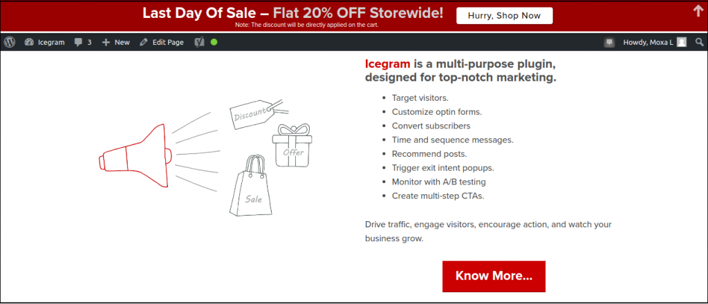
Below is an example of Icegram’s floating action bar displaying a scarcity offer of a Flat 20% OFF storewide offer.
Know more about all Icegram optins in details.
Steps to Create Exit Intent Optin with Icegram
Here’s a simple step-by-step guideline as to how to show any Icegram message on exit intent.
That’s it. It’s very simple to use the exit intent trigger on any of the Icegram optins.
Wrapping It Up
Using exit intent popups is a smart strategy to retain the visitors that are about to bounce from your website.
There’s nothing more you can do to keep the visitor on your site apart from displaying an instant message to them.
The exit popups do it beautifully and not only help to reduce the site bounce rate and increase the visitor’s time spent on the site, but also help to increase the site’s sales and subscribers.
Would you use exit popups and other exit optins on your website?
Have you tried the exit intent trigger on Icegram opt-ins?
If yes, share your experiences.

Thanks for the list. Really appreciate it
I have learned some excellent stuff here and these tips should be very helpful for me. I wonder how much effort you put to create this type of magnificent informative article. Thank you so much!!
I tried the exit intent popups and i must admit : they are great. 10% conversion up and that after just 1 week of testing.