If you ask the below question to the common people,
Why do you upgrade your skills / devices?
You might end up receiving the common answer, “To align with the trend and adopt compatibility with the latest tech”
Yes!
Being optimistic and adopting the trend drive better results and feel staying on the same page like most smart people. Considering the trend and user behavior, we have made major changes to our Icegram Engage plugin.
We call it Icegram Engage 3.0!
We have huge supporters who love using our plugin on their WordPress websites. This product blog post will explain to you the major UI updates we made in our recent release.
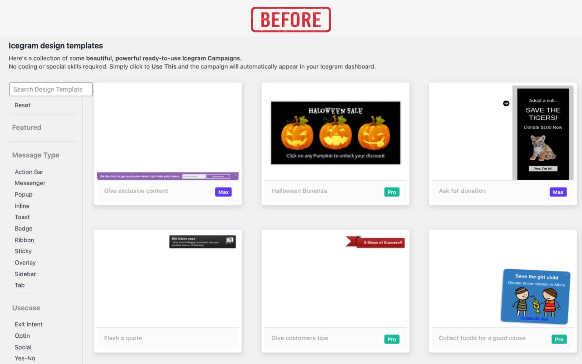
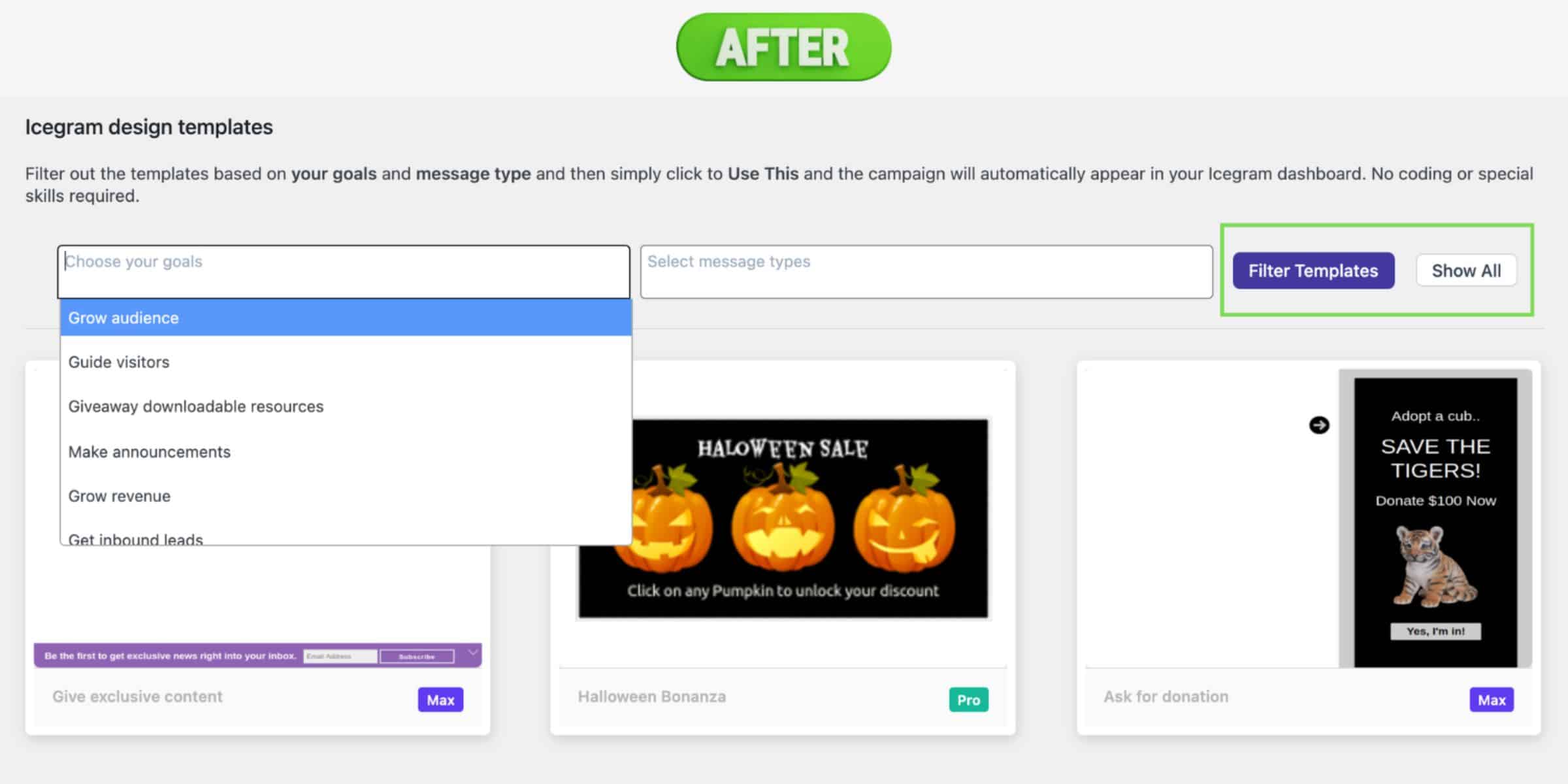
Filter gallery templates
Save more time choosing the right template for your campaign using the filter option. We made it easier for users to pick the right template based on the use case.
Choose your goals & select message types to filter the templates with ease.
See how we evolved by comparing the before and after images below.
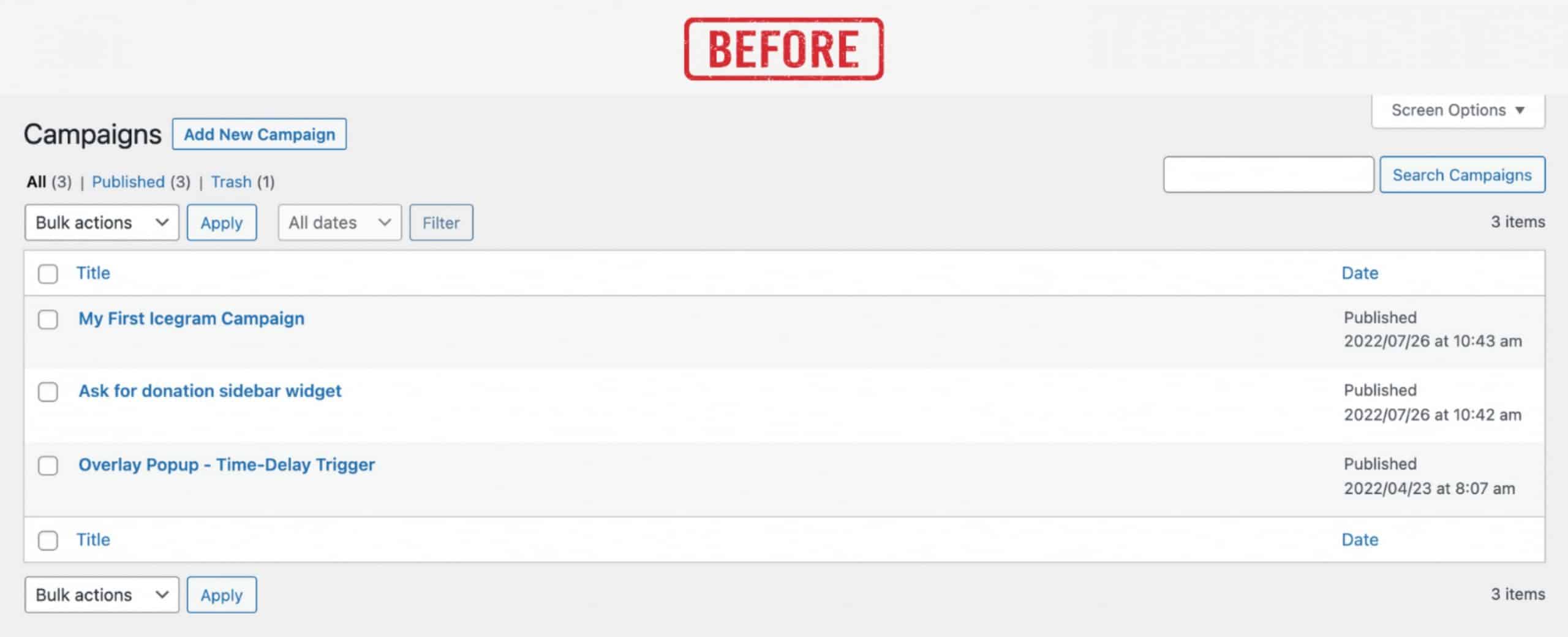
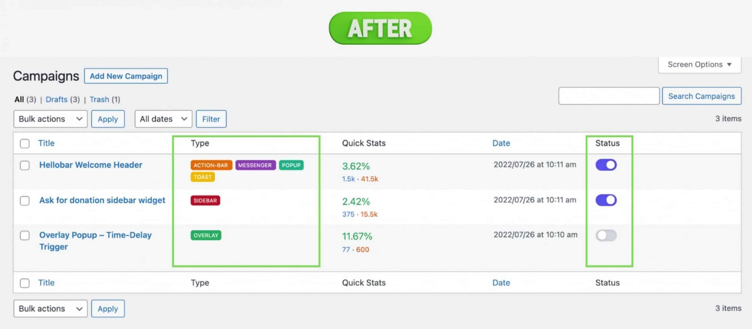
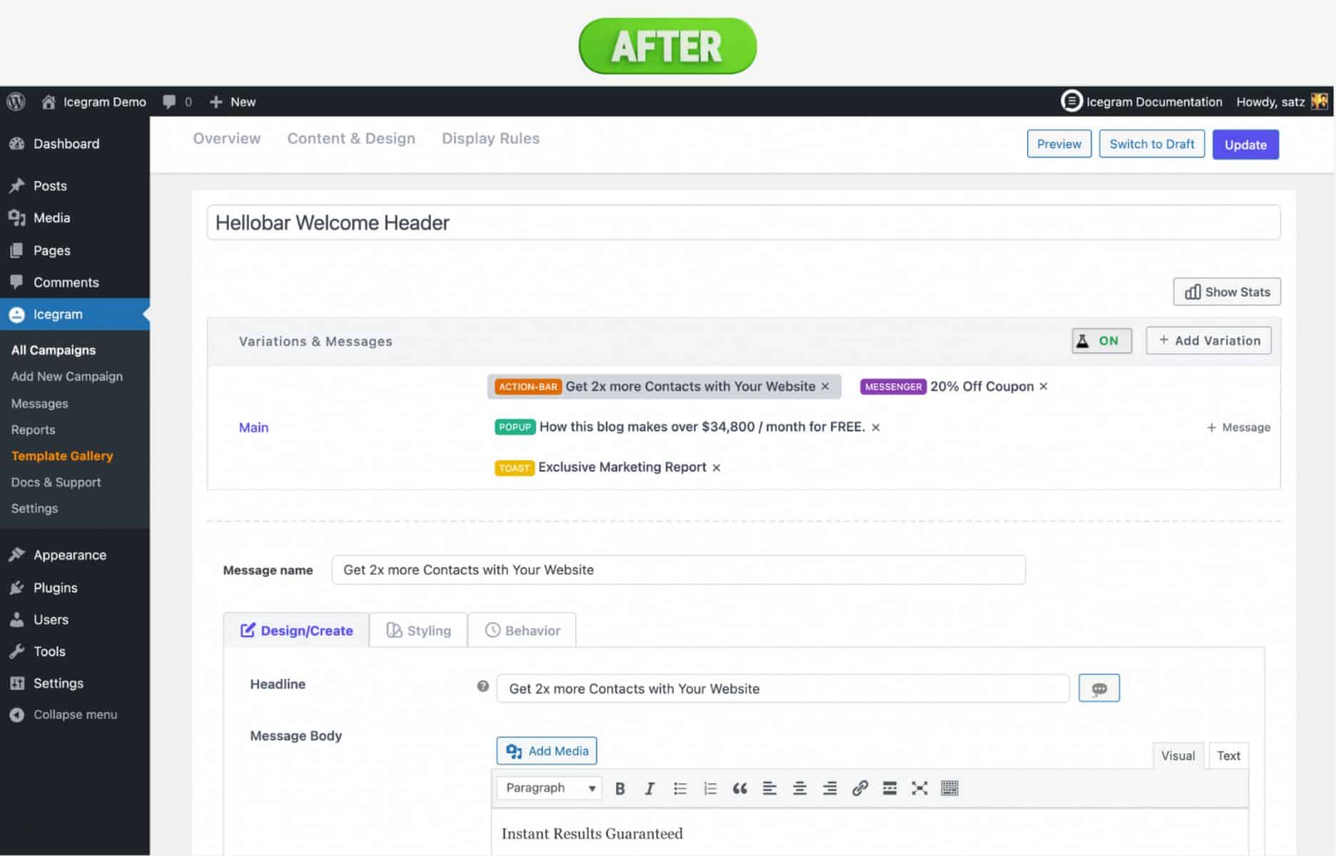
Colorful Message tag & toggle switch
Our new message tag with unique colors makes it easier for users to differentiate the message type.
Also, the status toggle switch helps to activate or deactivate the campaign in a single tap without entering every campaign setting.
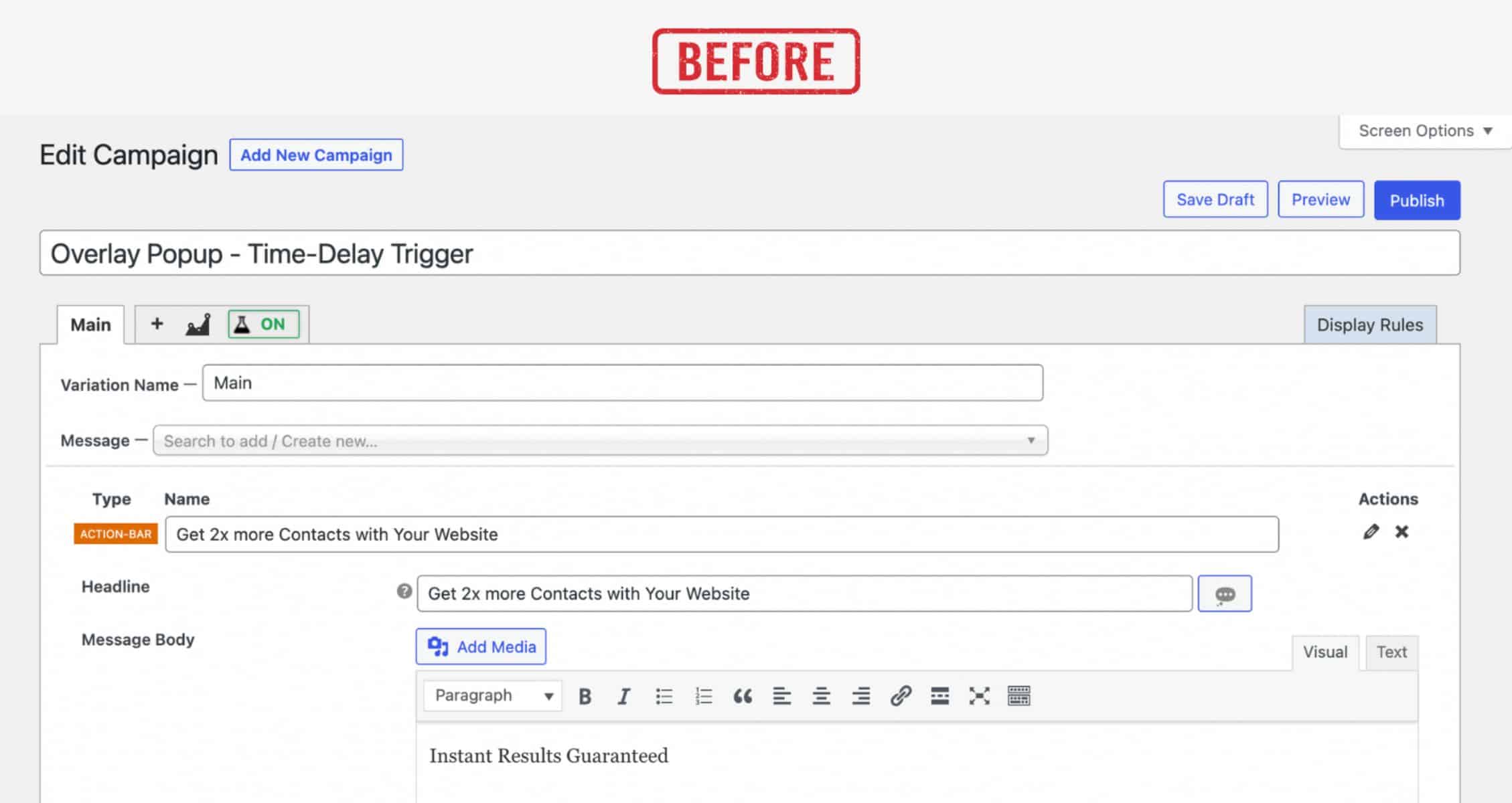
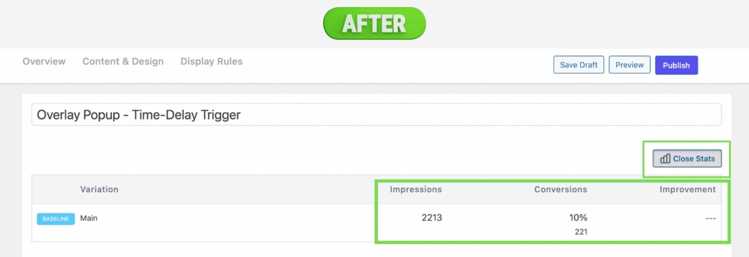
Improved campaign statistics interface
We have improved the campaign statistics interface within the editor. It shows Impressions, Conversions & Improvements of the campaign which helps you make proper decisions vividly.
Easy modernized multi-step UI in a one-page campaign builder
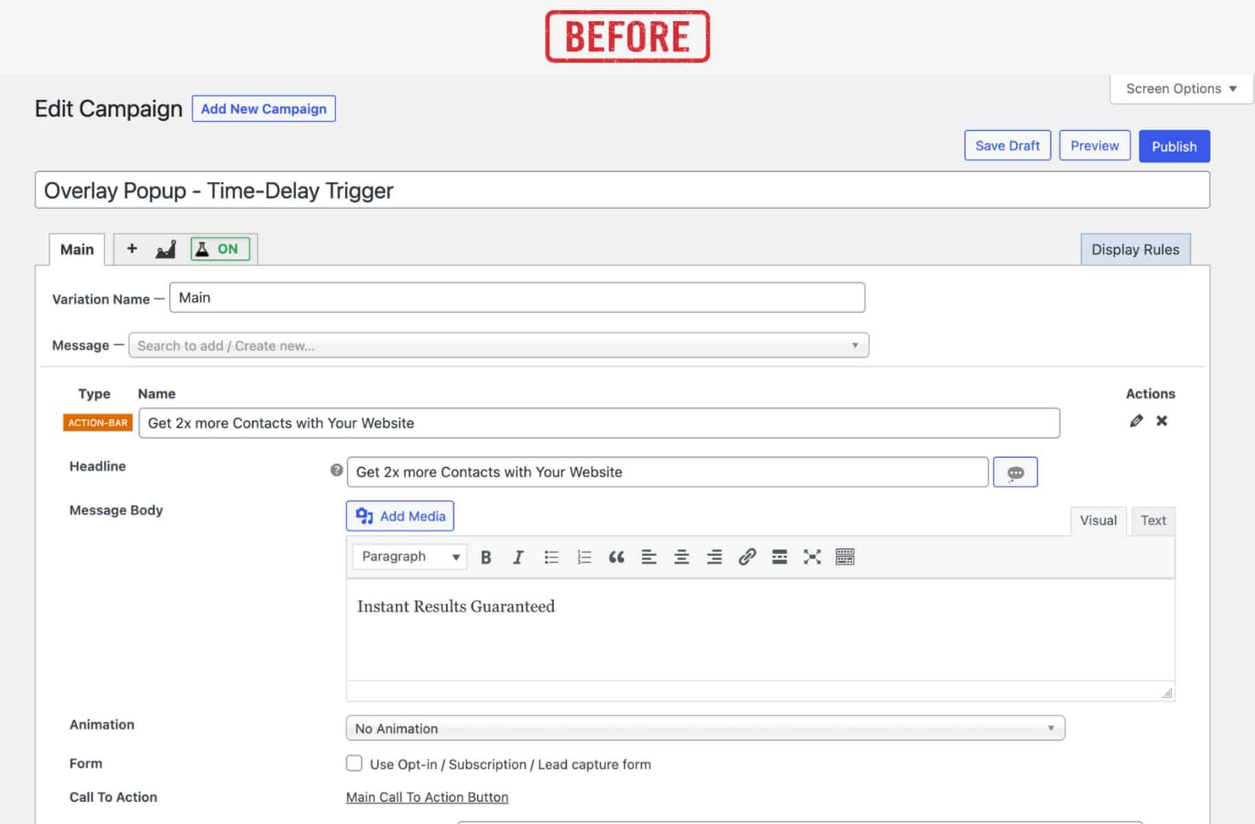
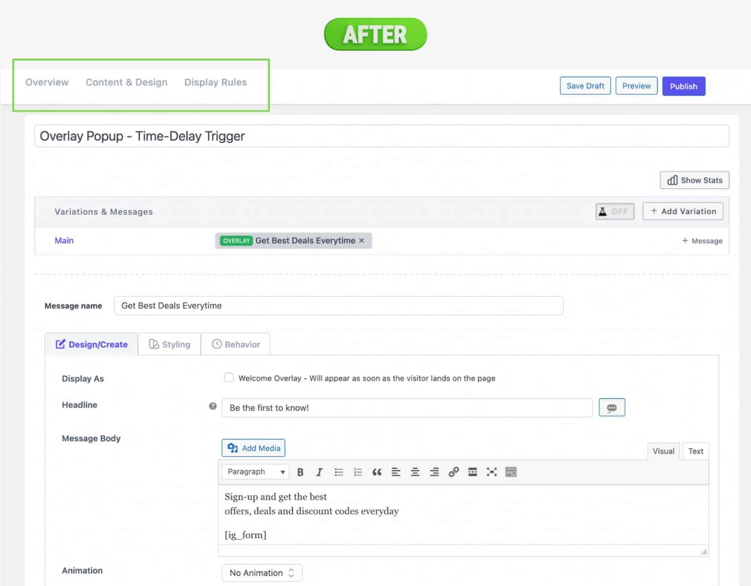
We have improved the campaign editor UI based on the user interaction and made every option stay on a single page. There are three steps within the one-page editor – Overview, Content & Design and Display Rules.
No more switching to other tabs or steps for creating your next lead generation campaign. Stay focused!
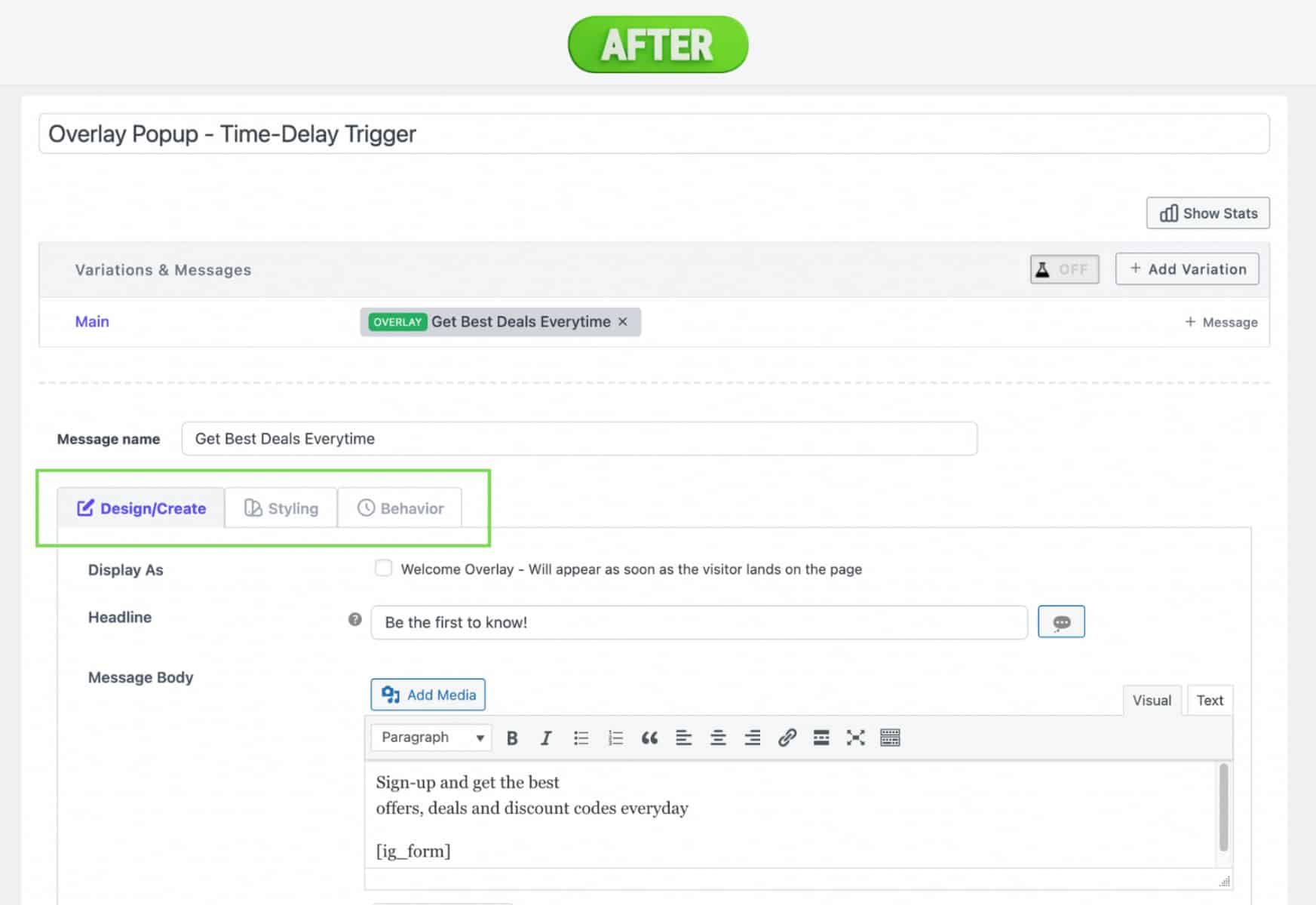
Tabbed section for quicker campaign creation
We have introduced tabbed style options for creating, designing and configuring behavior rules under singlehood. We have grouped these settings for more logical views to avoid confusion in moving forward to the next step.

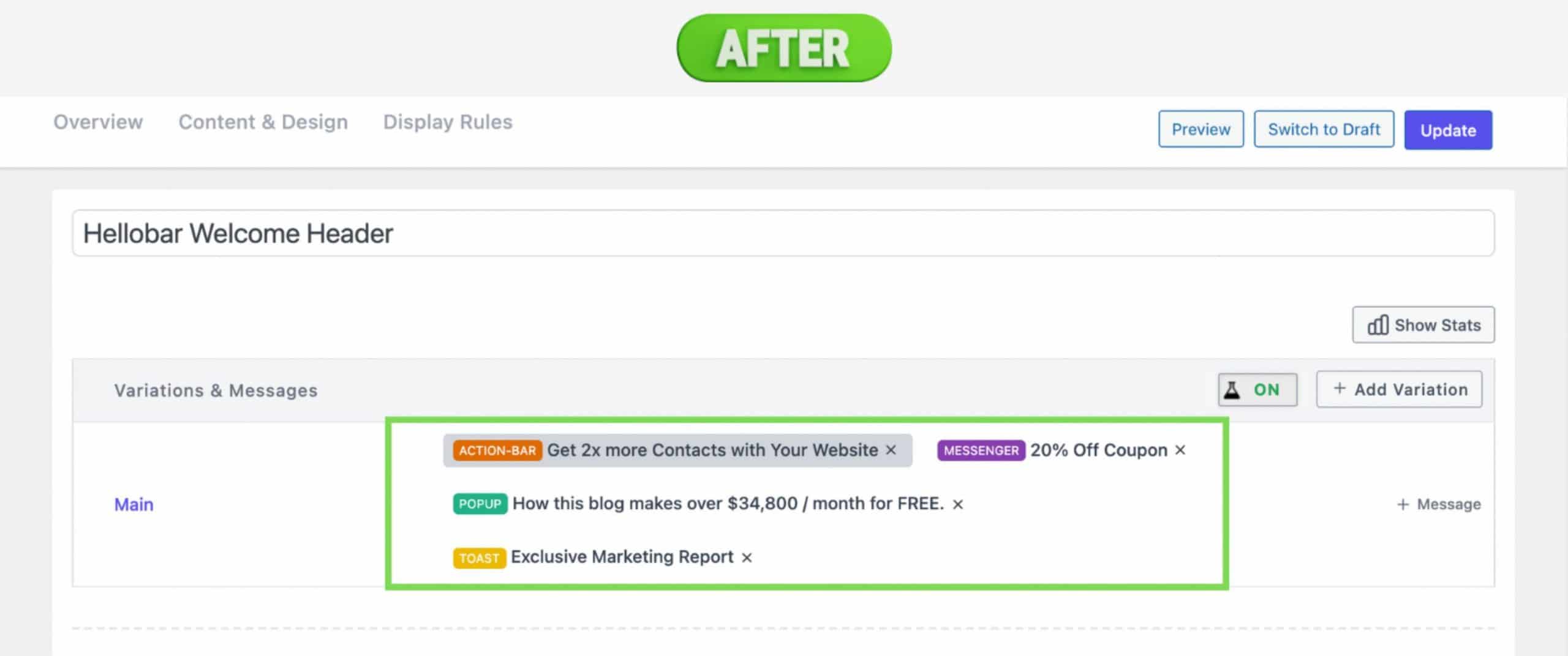
Grouped “Variations & Messages” section
Now, you can view all the variations & messages in a campaign in a single area for better understanding. Take prompt action based on the messages implemented in your campaign.
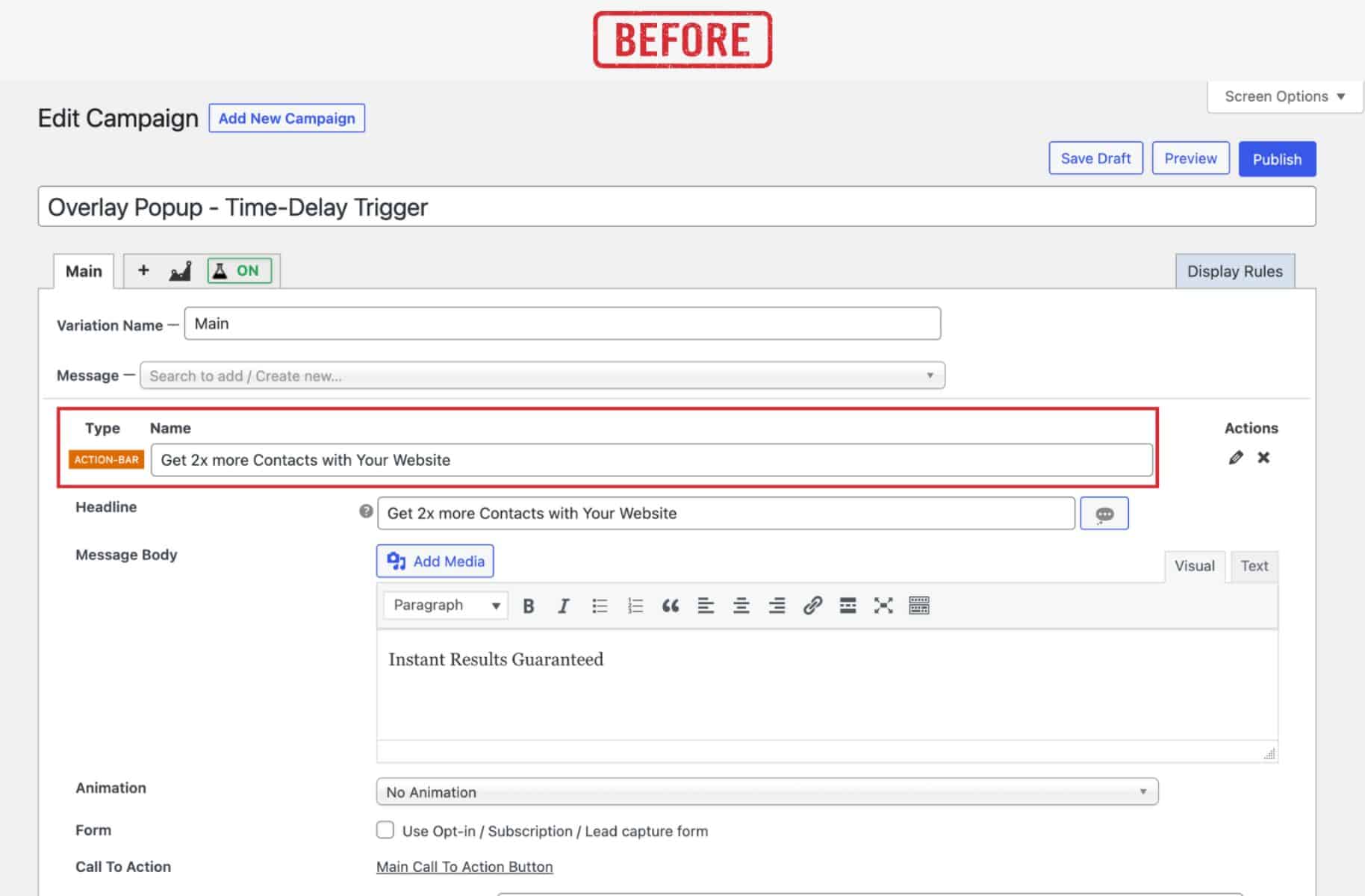
Wider UI spaced campaign area
After analyzing the trend, we found that a minimal clean design with a more white spacious look makes people feel comfortable with it. Considering the clean design, we expanded our campaign editor with a wider UI space.
Check out the editor UI changes below.
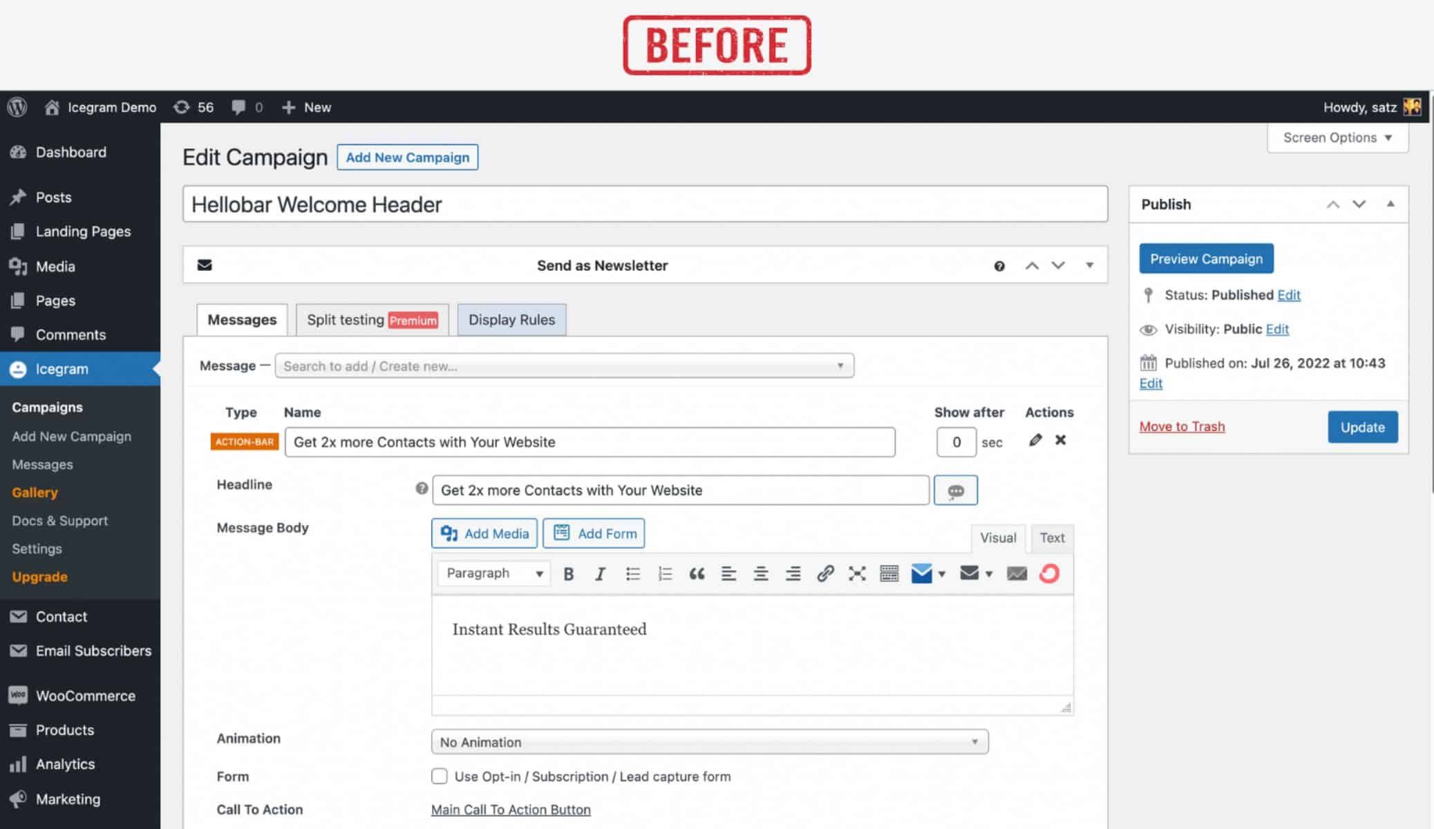
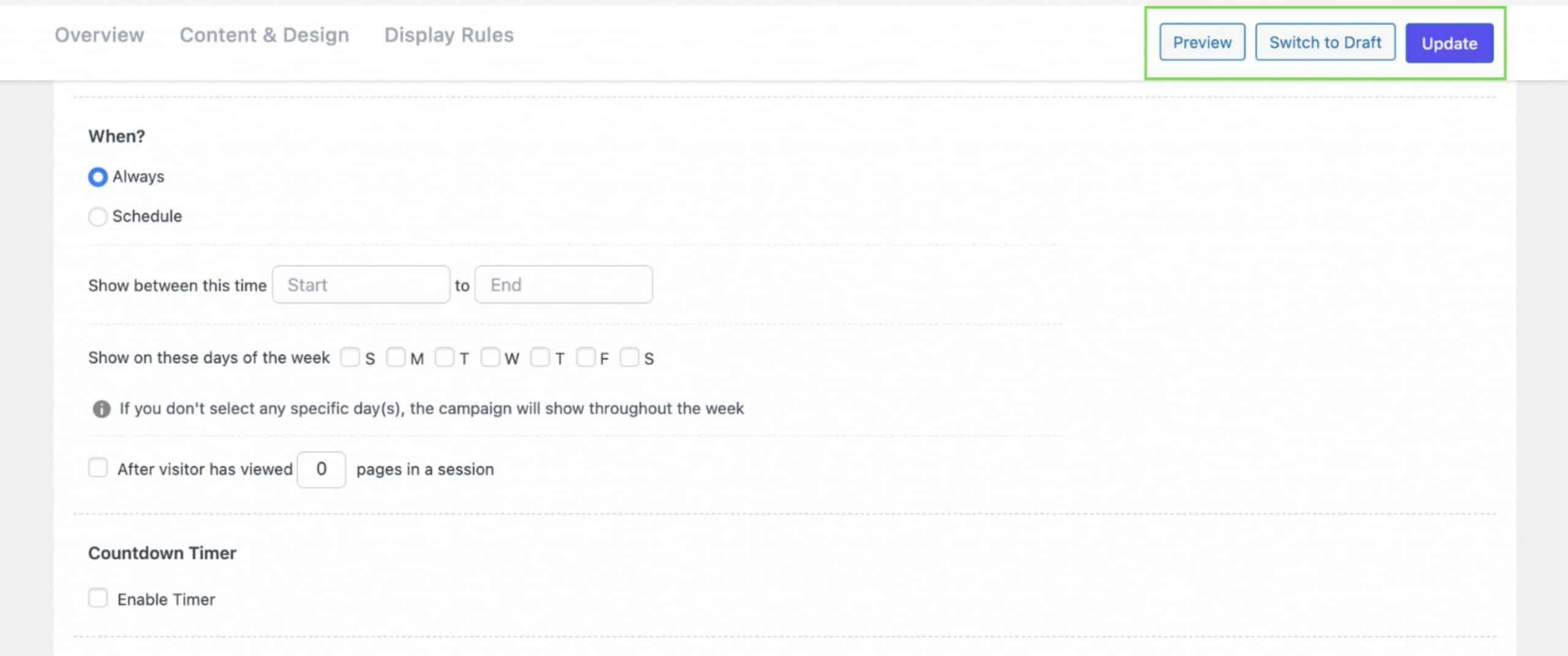
In our older versions, users should reach the top of the editor every time to save drafts, preview campaigns or even publish them. To make it more convenient, we introduced a static bar that helps users to navigate to the Save Draft, Preview and Publish button quicker than before.
That’s the quick overview of our Icegram Engage 3.0 release. We are aligning with the trend and technologies to make sure it fits our audiences.
The above UI changes would definitely help you build faster and better campaigns for sure.
Do you have any other suggestions for us to improve further?
Reach our support and share your queries today.

Nice