Have you ever gone to a website, looked around for a little, and then made the decision to leave without doing anything? Then you are not by yourself. Studies show that websites often have a 40% bounce rate, meaning that nearly half of visitors exit without making a purchase. So, marketers like me have to rely on effective exit-intent campaigns to engage visitors back. Let’s learn the trade of it in detail.
Plus, also discover some great tools to make your exit-intent popup campaigns super successful.
Are effective exit-intent campaigns really that helpful in 2025? What do legends say about them?
I’m sure you’ve experienced that moment when you’re all set to leave, and suddenly, it feels like someone is calling your name.
Well, exit-intent campaigns on websites work similarly to catch your attention just as you’re about to leave. They pop up unexpectedly, almost like a courteous last attempt to keep you engaged a little longer.
I think of them as polite assistants or doorkeepers of my WordPress sites. They always do their best to attract my website visitors. They can be in the form of freebies, discounts, a life-changing e-book or a quick chat.
I create exit-intent popups in the hopes that people will buy from me or take a little while to go over the other items or content on my website. When these popups appear, a lot of visitors decide to stick around or take a closer look or even go on check their cart again and buy the product. Thus, they are really practical and to my liking.
But, in order to captivate the audience that is leaving, your popups must be incredibly engaging.
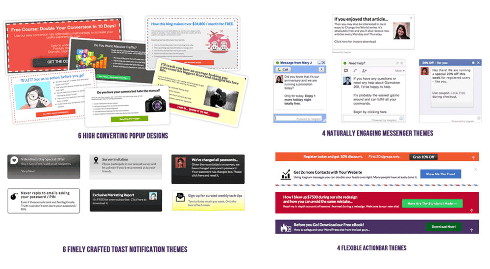
This is an illustration of an exit intent popup displayed by Icegram Engage. I use Engage for my e-commerce and SaaS clients. If you’re from these industries and use a WordPress/WooCommerce website, then try Engage for beautiful popups.
Here’s how Engage’s popup messages look like. Take a look at Engage’s templates gallery to get the best exit intent message.
Let’s see what other legends or brands has to say about these exit popups.
Exit popups, according to Mailchimp, offer one last chance to convert visitors, lower cart abandonment, increase email subscriptions, produce more leads, and improve overall website engagement.
Campaign Monitor, a MARIGOLD company, claims that strategically positioned and well-designed pop-ups can result in conversion rates reaching as high as 60%.
What strategies can be useful for effective exit-intent campaigns?
Remember those annoying popups that blast you just as you’re closing a website? Yeah, let’s not do that. Instead, let me share few strategies that works often.
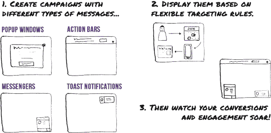
I’m excited to share how I craft top-notch exit popup campaigns using our Icegram Engage agenda.
Our clients have witnessed remarkable results, like a 150% increase in conversions, by following this unique outline or agenda.
Here’s a snapshot of Engage’s agenda.
Segmenting is the first thing you start with
When I’m about to create an exit popup, I try to understand who I’m targeting and what action I want my audience to take.
So, a question comes – who am I aiming at?
I always strive for laser-focused targeting in my popups, knowing it’s key to prevent site or cart abandonment.
Generic approaches don’t cut it for me; I tailor my messages specific to different segments or contexts.
This means I create different popup messages and layouts for different user groups or pages rather than using a one-size-fits-all message.
Before crafting my popup copy, I ponder over the intended audience.
Is it first-time visitors, cart abandoners, price-conscious shoppers, paid traffic or registered users? I gather insights into visitor identities and apply audience segmentation accordingly.
I also dig into behaviors, referral sources and intent to deliver more impactful messages.
Instead of focusing solely on users, I zoom into the context. Whether it’s a landing page, homepage, blog post, checkout or product page, each gets a unique exit popup.
For instance, someone leaving the homepage might need a warm welcome to start exploring further.
Personalization always brings the joy
Popups are meant for engagement and reengagement. One brilliant way I rekindle engagement is by infusing personalization into my exit popups based on each user’s interests and actions on my site. If you want the best results, you have to tailor your popup content using dynamic variables like:
- Their name
- Product preferences
- Real-time intent
- Subscription status
Referencing these personalized elements helps fortify the bond between the user and my brand. It shows that I genuinely grasp their needs, ultimately amplifying my chances of re-engaging with them.
Recommendations and urgency are must-have
Exit-intent campaigns can benefit greatly from recommendations that match the users’ preferences and behavior.
By showing them relevant products or services that they might have missed or overlooked, I can increase their engagement and retention.
For example, if a user has been browsing a certain product category, I can show them similar items or special offers that might appeal to them more.
Another way to boost conversions with exit popups is to create a sense of urgency that motivates users to act fast.
I often use countdown timers or exclusive, time-limited deals to create a sense of scarcity and fear of missing out.
Urgency can influence users to make quick decisions; for instance, a temporary discount code can persuade users to buy now before the deal expires.
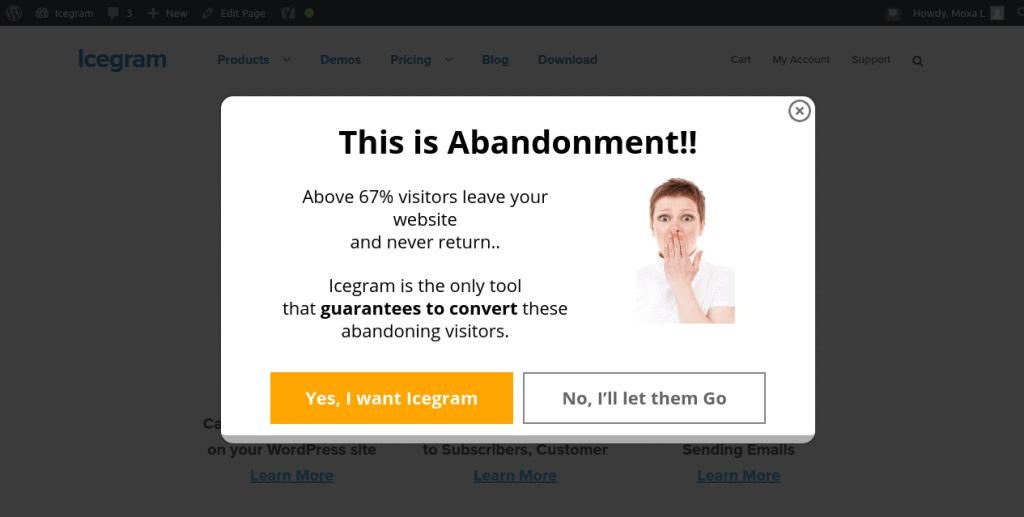
The graphic below shows how Icegram Engage’s popup with appropriate text steals the limelight.
How to make influential and effective exit-intent campaigns? What things can work?
If you want to ace the game of exit campaigns, you have to be both inventive and influential.
Few things are critical here, if you want to serve influentially.
- These popups must not be flashy, annoying and clumsy
- They shouldn’t display wrong messages on specific user activity
- Making an old offer is absolutely forbidden
- Don’t overuse exit-intent popups! Bombarding visitors can backfire. It can leave them feeling annoyed and less likely to return
Want to get more inspiration from Icegram Engage? Check the cool popups of Engage here.
Now, it’s time to make your exit-intent campaigns super awesome. So, let’s dive into that.
5 things to consider for effective exit-intent campaigns’ success
Almost all marketers and e-commerce experts consider exit-intent popups as powerful tools to convert abandoning visitors. But simply throwing up any odd popup won’t cut it. To truly reap the rewards, you have to efficient with your strategy and content.
Here are 5 things to keep in mind while making exit-intent marketing campaigns:
1. Targeting stays at the helm of everything
Personalize it: Don’t show the same popup to everyone! Use data like browsing behavior or location to tailor the offer and make it more user-relevant and appealing.
Right timing: Don’t trigger the popup too early or too late. Find the sweet spot where the visitor is on the verge of leaving but still engaged with your site.
2. Message and design should be like Disney and Pixar movies
Clear and concise: Your message should be instantly understandable, highlighting the value proposition in a few impactful words. We call it crisp popup content that can instantly instill thrill and excitement.
Compelling visual: Use an eye-catching image or video that grabs attention and reinforces your message. Add some animation or 2D elements. AI tools can be helpful to generate awesome digital content.
A strong call to action: Don’t mess around with it. Tell the visitor exactly what you want them to do next. Your CTA should be properly displayed and have enough potential to click. Try to be objective-driven when you think of CTAs.
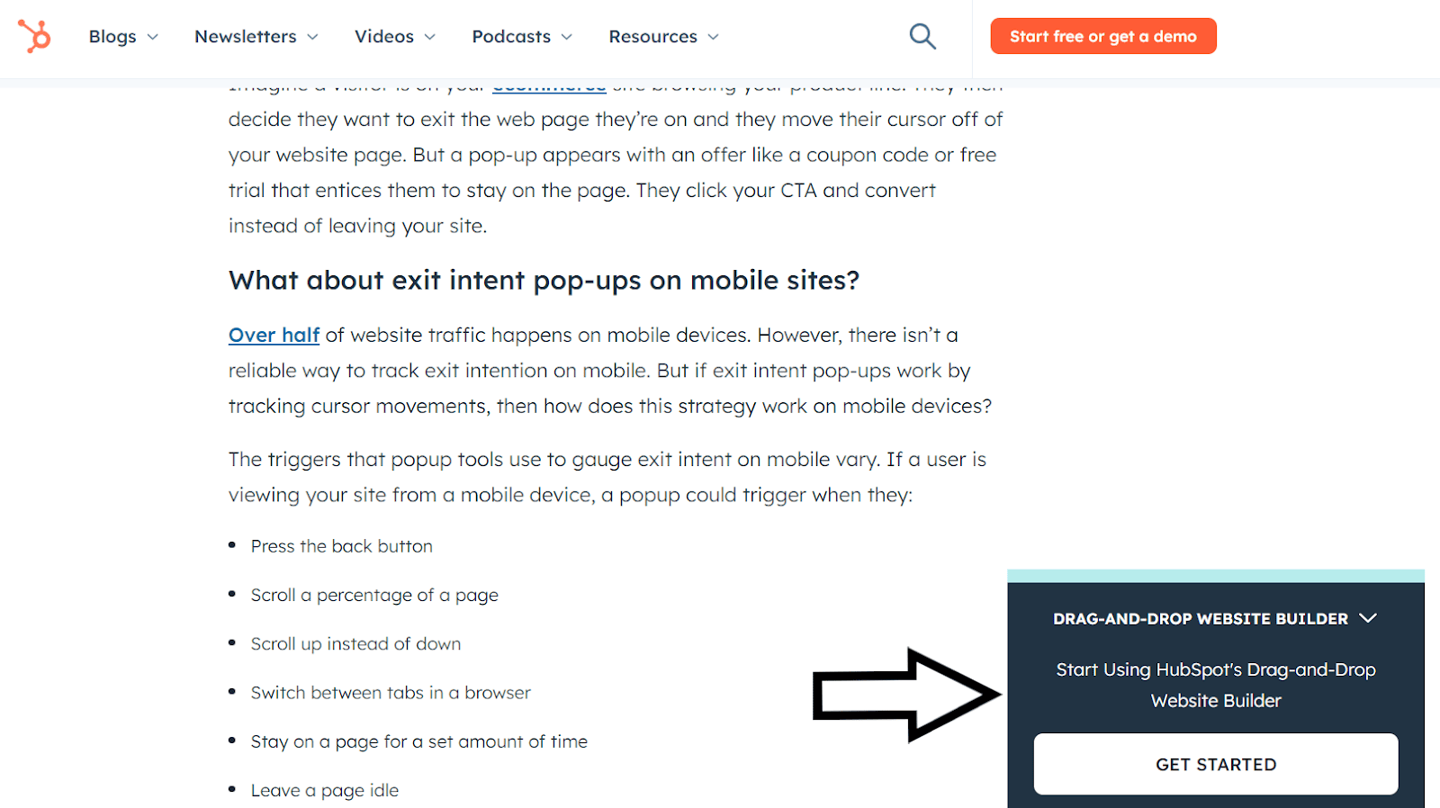
Here’s how HubSpot plays around with its popups. This CTA-focused popup is crisp and to-the-point.
3. Offers and incentives always do their best
Variety is key: Don’t stick to just discounts. Offer freebies, exclusive content, early access or other relevant incentives that cater to different motivations. If you’re into SaaS or AI tools business, give users some time to enjoy the tools’ benefits.
Scarcity: Use limited-time offers or mention limited quantities in your popups to create a sense of urgency. It’s a common notion that scarcity or urgency encourages immediate action.
4. Technical details are important to study
Mobile-friendly: Make sure your popups are optimized for mobile devices, where a large chunk of browsing happens.
Non-intrusive: Avoid popups that block the entire screen or take too long to load. Let visitors easily close them if they’re not interested.
A/B testing: Constantly test different versions of your popups, including timing, messaging and offers, to see what connects best with your audience.
5. Beyond the exit intent popups
Retargeting: Use the data you collect from exit-intent campaigns to retarget abandoning visitors with relevant ads or emails.
Optimize your content: Address common reasons why visitors might be leaving (e.g., unclear navigation, lack of information) to improve your overall site experience.
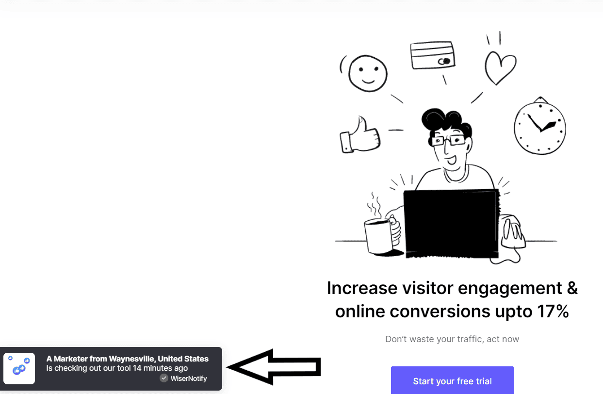
For example, WiserNotify is using a unique popup to show who is visiting its website. Though it’s not purely exit-intent but they can be used to retarget and keep the users engaged.
Here’s what I think of exit popups. I think of them as just one piece of the puzzle. The other pieces are strong and compelling content and an interactive website. I therefore take care to ensure that my website is glitch-free, gives good user experience and has information that is beyond amazing.
Finalizing everything – Effective exit-intent campaigns showdown
Are your website visitors leaving your website without purchasing anything? It’s time to use exit-intent marketing campaigns to convert those visitors into leads, subscribers or buyers.
Three things are of great concern when it comes to effective exit intent campaigns.
- The user-friendly popups
- The content inside them
- The CTA
If you already have a well-interactive website, then rest comes easy with little optimizations here and there.
If you want to use popup tools, there are ample in the market. There are SaaS popup tools and specialized popups marketing plugins.
For larger businesses with extensive engagement needs, SaaS tools like OptinMonster, WishPond, or Ninja Popups can be beneficial. They can turn little expensive as your business grows but they are trustworthy with scalability.
In my opinion, Icegram Engage, a cost-effective WordPress and WooCommerce plugin, is quite useful. Its WP free version offers unlimited popups like action bars, toasts, and messengers. If you need higher versions of this plugin, check the Pro and Max.
To learn more about popups marketing plugins, check this out.

