Do you see your visitors just click away from your website?
Wouldn’t it be great if there was a way to stop them from just bouncing off?
Well, there is something you can do about it. Enter exit intent pop-ups.
Exit intent pop-ups are deliberately positioned to send an offer to the visitors when they are about to leave.
Exit intent pop-ups are friendly website gremlins that present a value-driven offer when a user is all set to click away. This allows you to turn a possible goodbye into a part of your funnel.
Looking for actionable tips on exit intent pop-ups? The subsequent sections hold more knowledge for those ready for the next level.
Elaborating exit intent pop-ups
The more time a visitor spends on your website, the more awesome offers they will discover. Sometimes, a user might be moving on to another website too soon without considering the hidden gems of your business. That is the right time for exit intent pop-ups to flash on the screen.
Just when your visitors’ cursor starts to move toward the back button, or hover over the address bar, a friendly pop-up emerges.
These smart displays are a great way to keep visitors on your website to learn more about your business and eventually convert.
They might delve deeper into your content, join your email family, and finally decide to make a purchase!
The significance of exit intent pop-ups
The exit intent pop-ups can predict the time a visitor is about to leave your webpage empty-handed. Exit intent pop-ups intend to elaborate on the benefits of your goods and services to your visitors and convince them to stay for a longer time.
Exit intent pop-ups play a major role in mastering customer engagement along with other methods.
The following points sum up the purpose of exit intent pop-ups very clearly:
Eliminate cart abandonment
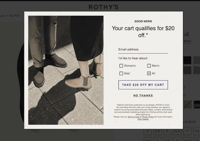
Exit intent pop-ups use lucrative measures like discounts and complimentary resources. These help in doubling up the opt-in rates and no carts are left alone by their owners.
Here’s an example of cart abandonment popup:
(Source: HubSpot)
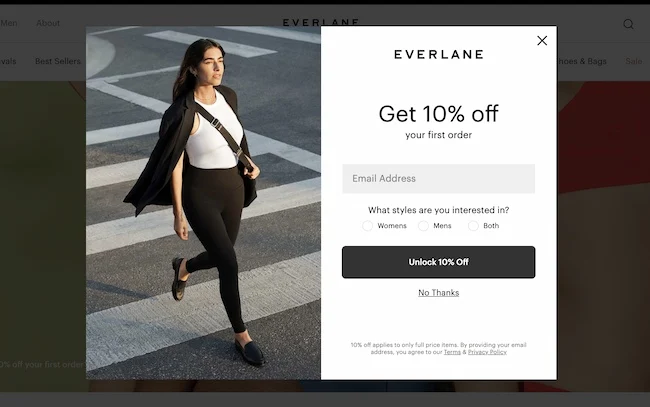
Here’s an example of exit-intent popups that are centered towards discounts:
(Source: HubSpot)
Makes the website magnetic
The exit intent popup, like a plot twist, grabs their attention with a whispered “Wait! There’s more!” This is not only applicable for attracting first-time visitors but also to present compelling offers to recurring customers as well. Exit intent pop-ups create a loyal fanbase as they have something for everyone.
Here’s an example of the same:

(Source: HubSpot)
Ghosted inboxes are now empowered by engaged subscribers
Visitors and customers are the lifeline of a business. A business could run dry if visitors forget about your business.
Forget all your struggles of growing your email list and say hello to a thriving community of subscribers.
Best tips for creating exit intent pop-ups
- Turn “goodbye” into “I’m intrigued!”. Make your exit intent pop-ups propose tempting offers like a juicy discount, a freebie they can’t resist, or exclusive content that sets your brand apart.
- Ditch generic CTA and opt for clear instructions like “Dive into Savings!”, “Click here for the ultimate prize!”, etc.
- Supercharge your exit intent campaigns with attractive visuals. The image on your pop-up is the key. It has to have two essential qualities: related to your offer and irresistibility.
- Don’t go overboard with your pop-ups. Overdoing any of the features of the exit intent pop-ups may confuse the reader. Rather keep it concise and benefit-driven will have a way more interactive and welcoming vibe.
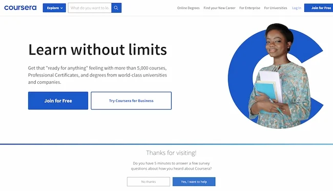
Here’s a benefit-driven example from Coursera.
(Source: HubSpot)
You can also add value such as discounts, freebies, and exclusive deals. However, it is important to consider that your offer matches the user’s intent.
- Studies show personalized popups double engagement rates and skyrocket conversions. Skip the generic blasts and tap into the power of tailored offers. But wait! Timing is key. Don’t rush the story. Let visitors explore, connect with your brand, and then surprise them with a perfectly timed personalized popup that says something like, “We get you!” This kind of planning comes under the category of behavioral email marketing strategies.
- Relevance in terms of types of exit-intent popups is vital as well. Before crafting popups, consider their various types. These include cart-based popups, content-based popups, and geolocation-based popups.
- In today’s era, when everyone is glued to phones, your digital footprint must be mobile-friendly. Always go for responsive, mobile-optimized exit intent pop-ups that work regardless of the device your audience is using. This means that besides being responsive, the popups must fit smaller screens, with an easy-to-tap close button and short copy for quicker interactions.
- Think your pop-ups are working? Think again! Consider A/B testing to find the perfect formula for engaging your audience. Every click is a clue, every headline a hypothesis.
- Monitor the effects of your exit content pop-ups. With data-driven insights, it becomes a lot easier to find where these gems shine brightest and why.
- Another best practice is segmenting your audience. You must show different popups for first-time visitors compared to the frequently visiting visitors.
- Using emotional triggers by using statements such as ‘Don’t miss out’ or ‘Your offer expires soon’ can significantly boost conversions.
- You must also ensure the frequency of the exit intent popups repeatedly to avoid visitors’ frustrations. The ideal timing and frequency will depend on time spent on the page (approximately 30 seconds), number of pages viewed before exiting, cart abandonment behavior and other factors.
We are helping you with all these features. Check out Icegram Engage’s pricing.
What are the common mistakes to avoid exit-intent popups?
Exit-intent popups fall short when the following mistakes creep in. Here’s what you must look out for:
- Offering generic discounts: One size doesn’t fit all! And that’s why you must make your offers relevant to the browser history or cart value.
- Intrusive popups: Make sure that your popups are easy-to-close options to avoid annoying your visitors, which could lead them to leave the website.
- Vague CTA: Vague messages simply don’t deliver the value that they should. For example, ‘Stay with us’ is less effective than ‘Avail 30% discount’.
- Poor timing and placement: Showing the popups too early can annoy the visitors while displaying them too late can lead to missed conversions. A/B testing could be a perfect way to test the right timing and placement.
- Overwhelming design & test: Too much text or an overwhelming design could do more damage than good. It would be ideal to maintain the right balance by keeping the popup visually appealing, a brief copy, and a strong CTA.
- Mis-aligning popups: Offering a discount to a visitor who is reading a blog post may not be relevant. Rather a relatable lead magnet like offering a free guide could work well.
Conclusion
Exit intent pop-ups are personalized whispers, offering a final morsel of value, a secret handshake between you and your audience. When used wisely, they can boost conversions, ignite conversations, and transform your website from a mere landing page into a thriving hub of connection. But wield them carelessly, and you risk alienating visitors, leaving them feeling trapped and frustrated. Remember, it’s not about cornering your audience but enriching their journey.
The success rate for the exit-intent popups can be measured by conversion rates, bounce rate reductions, and the A/B testing results.
Small tweaks can make a huge difference. And this holds perfectly true for exit-intent popups.
Then why not go ahead and make those changes to see magnificent results?
Begin your journey with Icegram Engage!
FAQ
Can exit-intent pop-ups be used on mobile devices?
Yes, but they work differently. Instead of tracking mouse movement, mobile exit-intent pop-ups trigger based on scrolling behavior or when a user tries to switch tabs.
Are exit-intent pop-ups GDPR compliant?
They can be, as long as they follow data privacy guidelines. If collecting emails, ensure there’s a privacy policy link and an option to opt out.
Do exit-intent pop-ups slow down a website?
When optimized properly, they have a minimal impact on site speed. Using lightweight scripts and a well-coded pop-up tool helps maintain performance.
What types of exit-intent pop-ups perform best?
Pop-ups with a compelling offer (discount, freebie, or exclusive content), a clear CTA, and a minimalistic design tend to perform the best.

