With the introduction of newer technologies and features, crafting email campaigns is easier than ever before. As a marketer or business owner, mastering the art of compelling email design is a must-have skill in your arsenal.
Lucky for you, you’ve stumbled upon the ultimate guide that’s going to help you do just that!
From the latest trends in email design to tips on how to improve email open rates, we’re covering all grounds. Whether you’re a seasoned email marketer or just starting out – this comprehensive guide is for you.
So, get ready to jazz up your email campaigns and make every click count.
Expect to dive deep into:
- Best practices for crafting visually appealing emails
- How to use videos in your email campaigns
- Mastering the art of creating effective email templates
- Boosting your email marketing efforts with A/B testing
Ready to level up your email design game? Let’s get started!
How email design has changed over time
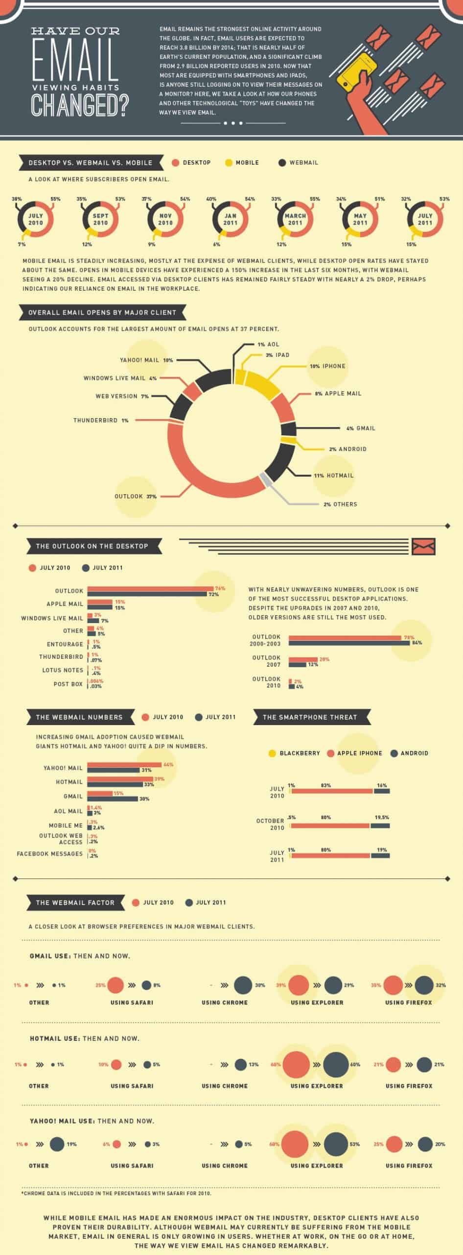
Over the years, the design of emails has undergone significant transformations, evolving from simple plain text messages to dynamic, visually captivating experiences. As technology advanced, so did the possibilities for email design, leading to the emergence of new trends and practices.
Let’s take a journey through time to explore the evolution of email design and where it stands in 2025.
(source: Visme)
In the early days of email, design options were limited. Plain text emails were the norm, primarily used for communication rather than marketing or promotional purposes. Emails were primarily focused on conveying information through text and lacked visual appeal or interactive elements.
However, as technology progressed, so did email design. The introduction of HTML emails revolutionized the way businesses approached email marketing. HTML allowed for the inclusion of images, colors, and formatting, enabling brands to create visually appealing and engaging email campaigns.
This shift marked the beginning of a new era in email design.
As we fast forward to 2025, the future of email design is characterized by three key elements: personalization, dynamism, and interactivity.
Personalization
(source: Visme)
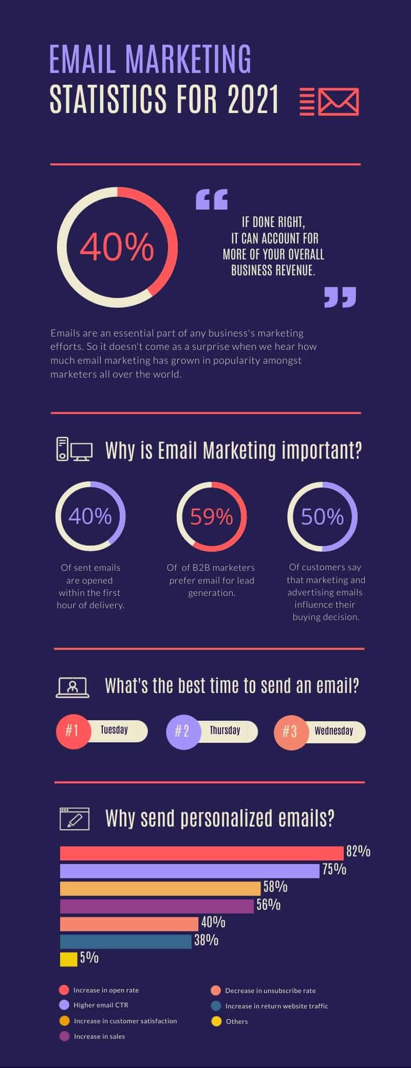
In email design, personalization goes beyond using a subscriber’s name in the email. It’s about tailoring the entire email experience to each individual user, from the content and design to the email templates used.
This level of personalization increases the likelihood of users engaging with your emails, thereby helping to improve email open rates.
Dynamism
In 2025, emails are no longer static. They’re dynamic, changing based on the recipient’s behavior, preferences, and even the time they open the email. This makes each email unique and significantly more engaging.
Interactivity
Videos, carousels, and countdown timers are just a few examples of interactive elements that make emails more engaging and fun. Moreover, interactivity allows users to take actions directly within the email, from shopping to watching videos, thus enhancing user experience and improving conversion rates.
So, as we move further into 2025, it’s clear that the world of email design is only going to get more exciting. It’s time to embrace these trends and start creating email campaigns that are sure to captivate your audience.
Email marketing with videos: why and how to do it right
By 2025, video has evolved from a luxury to a necessity in the world of email marketing. It’s no longer a question of if you should integrate video into your email campaigns, but how to do it effectively to improve your email open rates. Let’s dive into the whys and hows of using videos in your email marketing.
The why: Benefits of using video in email marketing
(source: Visme)
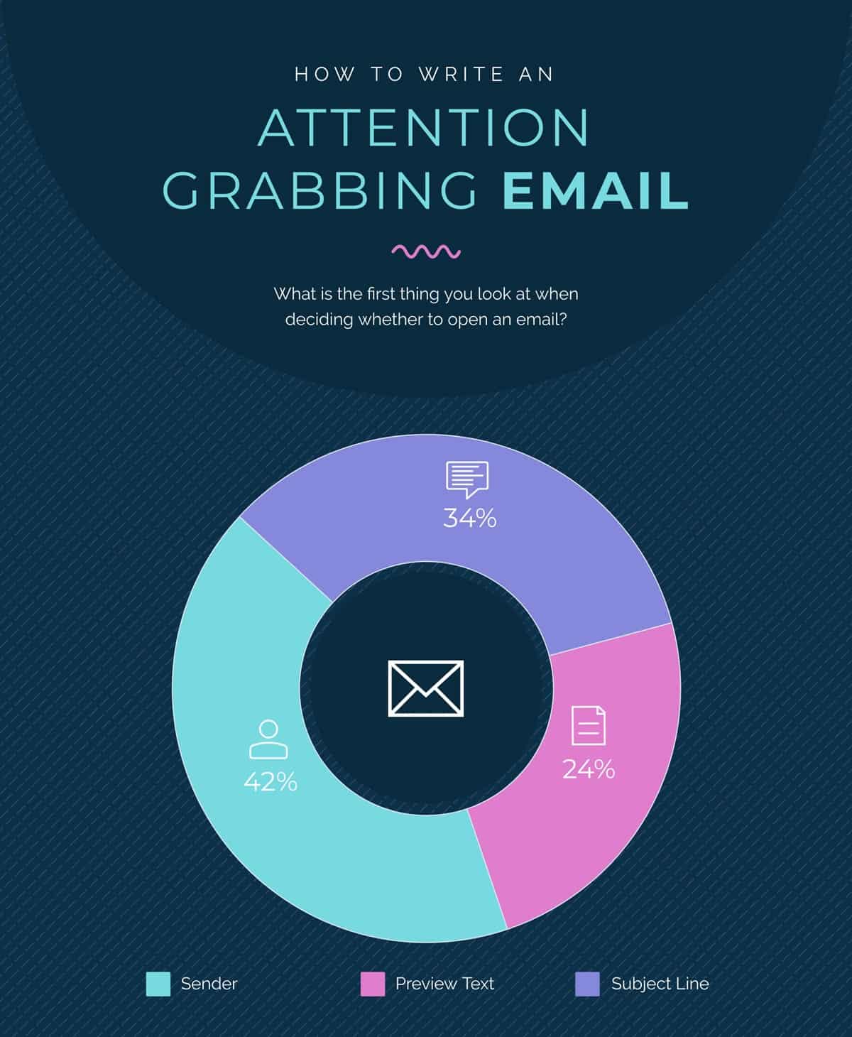
Videos have a knack for grabbing attention and engaging audiences like no other medium. In email marketing, this translates to improved open rates and conversions. Here’s why:
- Improved engagement: Videos can tell a story more effectively than text and static images. This makes your emails more engaging, improving your click-through rates.
- Increased trust: Videos can showcase your product or service in action, helping to build trust with your audience.
Higher conversions: With enhanced engagement and trust, your audience is more likely to take the desired action, leading to higher conversion rates.
The how: Incorporating videos into your email design
Now that we’ve covered the why, let’s tackle the how. Here are some expert tips to help you incorporate videos into your email design effectively.
- Use a captivating thumbnail: A compelling thumbnail can significantly improve your video play rates. Make sure it’s visually appealing and gives a hint of what the video is about.
- Keep it short and to the point: Your video should be short enough to hold the viewer’s attention, but long enough to effectively communicate your message.
- Include a clear call-to-action (CTA): After watching the video, your viewers should know exactly what you want them to do next. A clear and compelling CTA can guide them in the right direction.
Remember, A/B testing is your friend. Experiment with different video lengths, thumbnails, and CTAs to see what works best for your audience. With these tips in mind, you’re well on your way to leveraging the power of video in your email marketing.
Creating engaging email templates
Designing a visually appealing email template goes beyond aesthetics. It’s about creating a memorable experience that resonates with your audience. With the right email template, you can increase your email open rates and ensure your message gets across.
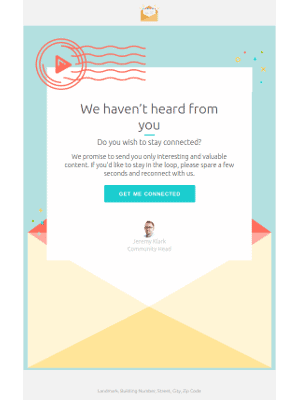
Always aim for simplicity. A cluttered email distracts and confuses your readers, undermining your message. Make use of white space, choose fonts and colors that align with your brand, and maintain a logical flow of information.
Remember, your email template should be flexible enough to accommodate different types of content and responsive to various screen sizes. In 2025, the majority of emails will be opened on mobile devices, so ensure your design looks great on both desktop and mobile.
Improving email open rates
As crucial as it is to have a well-designed email, it still boils down to whether your email gets opened. Here’s where the subject line comes in. It’s your first (and sometimes, only) shot at attracting your reader’s attention. Craft catchy, concise, and personalized subject lines to improve your open rates.
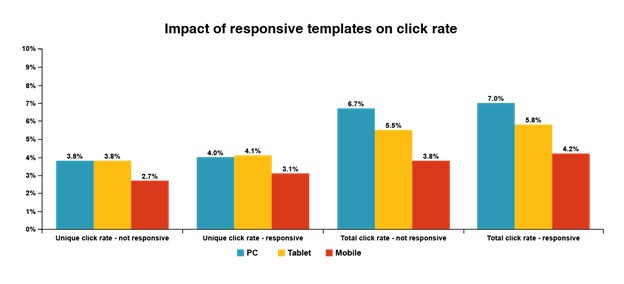
(source: CXL)
In 2022, the average open rate was 19.66%, while 22% of marketers achieved email click-through rates exceeding 20%, surpassing the industry average of 10.69%, and the average click-to-open rate was 10.5%.
Timing is another critical factor. There’s no one-size-fits-all as it depends on your audience, but generally, sending emails during the workweek and avoiding weekends and holidays can yield better open rates. A/B testing can help you find the optimum time for your audience.
Keeping up with email design trends
Think of incorporating elements like quizzes, polls, or even games in your emails to engage your readers.
Moreover, accessibility is not just a nice-to-have but a must. Ensure your email design is accessible to everyone, including those with disabilities. This not only broadens your reach but also promotes inclusivity.
The journey to mastering email design is a continuous learning process. With these tips and a keen eye on the latest trends, you’re on your way to creating captivating and effective email campaigns in 2025.
The latest trends in email design: what’s hot and what’s not for 2025
Recent data reveals that the global daily volume of emails sent and received in 2025 has reached 347.3 billion, representing a 4.3% growth compared to the preceding year’s figure of 333.2 billion emails per day.
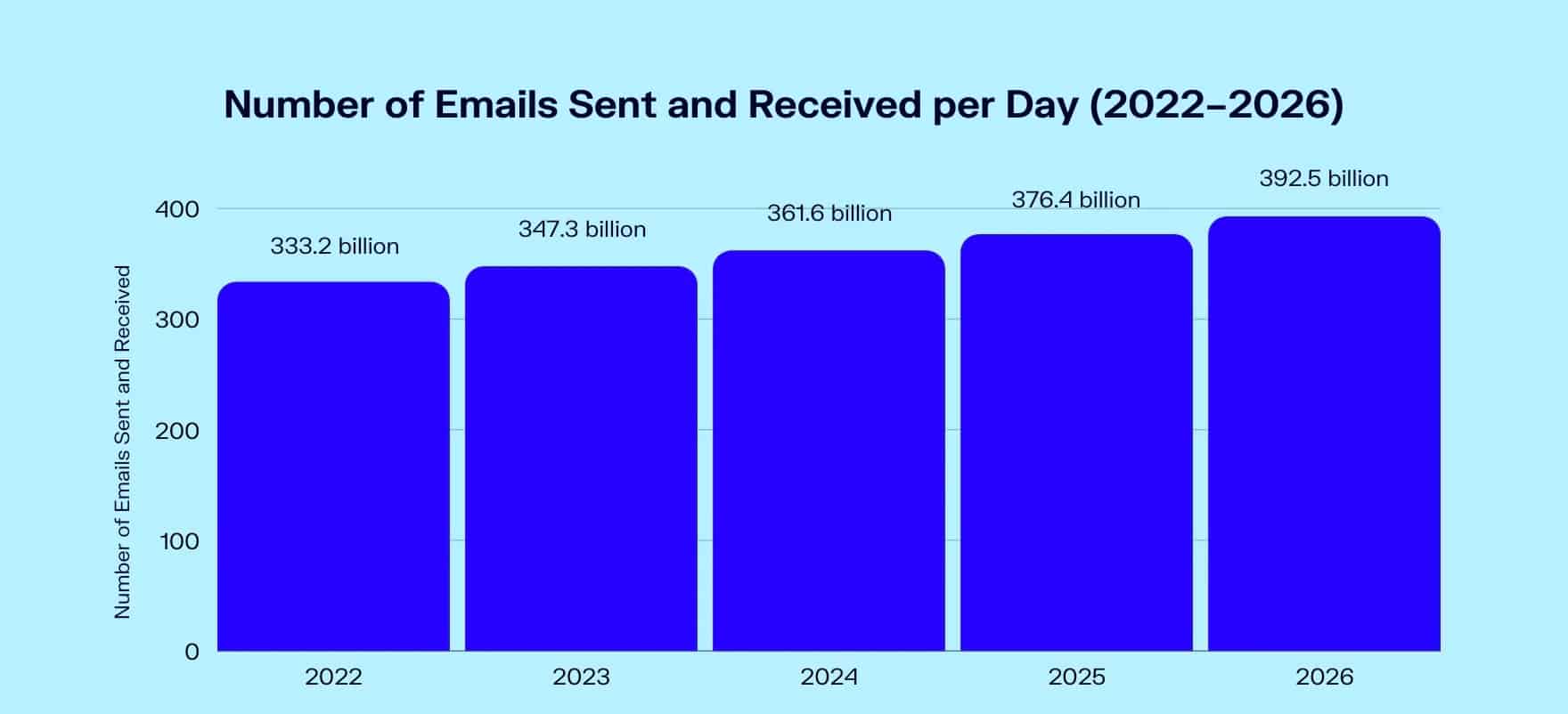
(source: Oberlo)
So, what’s hot in email design right now? And what’s already yesterday’s news? Let’s take a closer look.
Interactive emails
Say goodbye to static, boring emails. Instead, think of interactive features like quizzes, surveys, or even videos that make the recipient part of the story. These elements not only boost your email open rates but also engage your audience in an entirely new way.
Minimalistic design
This year less is more when it comes to email design. Simplistic, minimalistic designs with clean lines and a clear call to action are taking center stage. Skip heavy images and complex designs. Focus more on delivering value straight to the point.
Dark mode compatibility
If your email templates aren’t dark mode compatible yet, it’s high time you consider this change. With more and more users switching to dark mode, making your emails compatible is not just a trend – it’s a necessity. Remember, email design is as much about accessibility as it is about aesthetics.
Bold typography and colors
Even with a minimalistic approach, bold typography, and vibrant colors are in vogue. They enhance visibility and grab attention, ensuring your email campaigns stand out in crowded inboxes.
Storytelling and personalization
Last but not least, storytelling and personalization are more crucial than ever. While not exactly a design element, these strategies play into the overall experience of your email design. Craft narratives that connect, and remember to leverage data for personalization. This can significantly improve your email open rates.
On the flip side, outdated practices like overusing stock images, ignoring mobile optimization, and using too many fonts are no longer effective. Remember, the best email design is user-focused. Keep up with the trends, but also conduct regular A/B testing to understand what resonates with your audience.
How can I create visually appealing emails for my email campaigns?
Creating visually appealing emails is a combination of art and science. It’s about having a keen eye for aesthetics while keeping in mind the principles of effective communication. Here are a few tips to help you create stunning email designs for your campaigns.
Select a suitable email template
Start by choosing a responsive email template that aligns with your brand’s image. The secret here is to keep it simple. Overly complex email templates often distract from the message you’re trying to convey.
Use compelling visuals
Visual elements such as images and videos can help draw the reader’s attention and make your emails more engaging. In 2025, the integration of short, looping videos in email design is trending, so consider experimenting with this feature.
Optimize for readability
Remember, less is more. Break up text into small, digestible chunks and use bullet points or numbered lists where appropriate. This improves the readability of your emails, making it easier for readers to absorb your message.
Apply color psychology
Color can have a significant impact on how your emails are perceived. Use colors strategically to evoke certain emotions or reactions from your readers. For example, red can create a sense of urgency, while blue can instill trust.
Consider A/B testing
It is a great way to figure out what works best for your audience. Try different design elements, layouts, or colors, and measure how they affect your email open rates.
In conclusion, an effective email design is one that not only looks good but also resonates with your audience and communicates your message effectively. It’s a delicate balance, but with practice, you’re sure to master the art of email design!
How Icegram Express can help with email designs
When it comes to email design, Icegram Express is your secret weapon. This powerful tool is packed with features that can help you craft visually stunning and effective email campaigns. Let’s delve into how Icegram Express can assist you in mastering your email designs.
Robust email templates
Icegram boasts a treasure trove of professional and highly customizable email templates. These templates are not only engaging but they also look great on all devices. The best part? You don’t need any design skills to create visually appealing emails.
Boost your open rates
With features like advanced analytics and segmentation, you can tailor your emails to your audience, resulting in higher open rates and more conversions.
Optimize with A/B testing
Not sure if your email design is working? No problem. With Icegram Express’s A/B testing feature, you can try out different designs and content to see what resonates best with your audience. It’s like having your own personal email marketing lab.
So there you have it. With Icegram, creating striking and effective email campaigns has never been easier. Whether you’re a newbie or a seasoned pro, Icegram has all you need to take your email marketing to the next level.
Conclusion
And there you have it – your ultimate guide to acing email design in 2025! It’s been a thrilling journey exploring the world of captivating email campaigns, stunning templates, and ingenious marketing strategies.
Remember, the key to success is constant innovation. Don’t just rely on what’s been working so far. Experiment with new layouts, incorporate videos, spice up your content, and always, always keep your audience in mind.
Feeling overwhelmed? Don’t be. Just take it step by step. Start by focusing on your email design. Try out different email templates until you find one that truly represents your brand. Then, work on your content and figure out how to make it more engaging!

