Just as an artist spends days perfecting even the smallest details in a painting, the same attention to detail is crucial in email marketing, including the often-overlooked email footer design.
When was the last time you paid attention to your email footers? These little sections at the bottom of your emails have the power to transform a standard email into a highly effective marketing tool.
In this article, we’ll explore why email footer design is essential in 2024 and how optimizing this space can enhance your branding and marketing efforts.
Professional Appearance
Email footers contribute significantly to your professional image. Using a consistent email footer design establishes brand consistency, improves brand recognition, and creates a cohesive and professional identity. It helps the recipients identify that the email is from you.
It’s also a good way to complete your email, re-establish your connection with the audience, and showcase your dedication to your work. A well-crafted email footer enhances creativity and builds trust, making your brand more credible and reliable.
Includes Essential Information
Another important reason to pay attention to email footers is their usability.
The email footer is like a mini billboard at the end of your email, where you can professionally put the essential details.
The most important thing you can include in this mini billboard is contact details. You can include your name, email address, or even phone number. You can also reinforce your brand identity by adding the company name and logo with the URL. Or if you have an offline store or office where you want the reader to visit you can add the physical address of that.
By including this essential information in your email footers, you can help the user know how this email is coming and what actions they can take in response. For example, to visit the website or the physical location for more information, or whom they have to contact for more details.
Compliance
Email footers also play a crucial role in ensuring proper compliance with several regulations like the CAN-SPAM Act or GDPR depending on the country you operate. These regulations emphasize the importance of user consent, transparent communication practices, and the rights of individuals to control their personal information.
If you don’t comply with these regulations, you can attract financial penalties, loss of business reputation, loss of customer trust, and legal challenges.
Your email footer should include legal disclaimers, privacy policies, and unsubscribe links to ensure your emails comply with regulations. Additionally, it can provide industry-specific information, such as financial disclaimers, to help you adhere to sector standards and avoid legal risks.
Feedback
An effective email footer design can also be a platform for soliciting feedback. Engaging readers by asking for their opinions can help build rapport and foster a sense of involvement.
This feedback can offer valuable insights into how your audience perceives your products or services, enabling continuous improvement.
Social Proof
Including social proof in your email footer—such as customer testimonials, awards, certifications, or notable partnerships—can strengthen your brand’s credibility.
Showcasing these achievements and associations helps alleviate any doubts potential customers might have and boosts their confidence in choosing your brand over competitors.
Case Studies of Renowned Brands
Grammarly
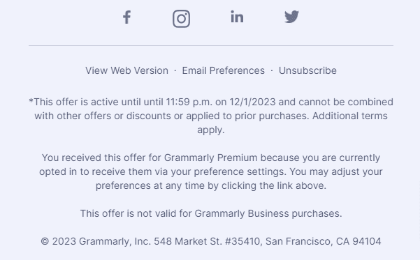
If you look at the Grammarly footer design, you would not see how effectively they have used this place. They have placed all important elements like their social media buttons, offer details, reason why you are receiving the email, and the unsubscribe link (without mentioning the unsubscribe word explicitly).
Forever21
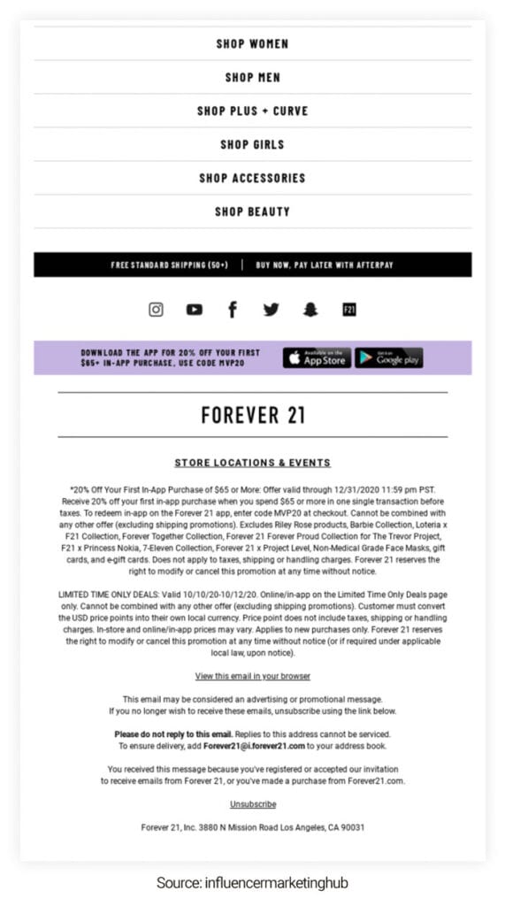
Let’s move on to the next brand which is Forever 21. If you look at the picture, you will find how detailed their email footer design is. They have strategically used email footers to motivate readers to make purchases. They have mentioned various categories so that the reader can choose what they like. They even mention the benefit of shopping with them like free standard shipping now and paying later. They have also placed the social media buttons strategically. And even showcase their mobile app. Apart from that, they have also mentioned the store location and ongoing deals and events.
Drunk Elephant
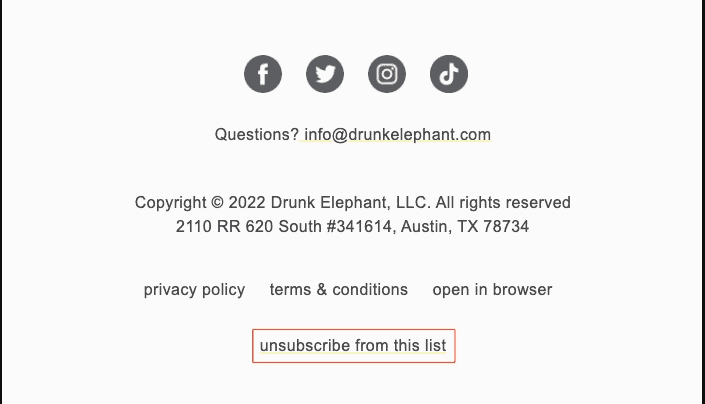
Now let’s take a look at the Drunk Elephant email footer design. If you don’t like stuffing information in your email photo you can use this space as the brand Drunk Elephant does. They have only placed their social media icon with a few other information like contact details, address, and legal compliances. They have followed the minimalistic approach and keep the font and colors aesthetically calming.
Apple
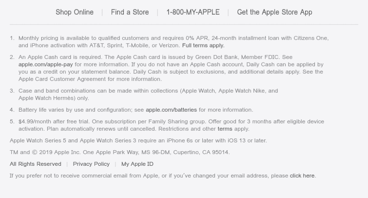
From Apple footer design, you can learn the importance of the email footers. They have used the space strategically to place all the important information about their products. It is generally the information that not all of the readers need but is very important. It’s like a mini user guide that can be helpful for users who are having trouble with Apple products. They have also subtly placed their CTA buttons like shop on, find a store, get the Apple store app, etc.
Medium
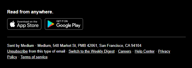
Medium uses the email footer space to encourage their readers to download their mobile application. They have given options for both Android and iOS users.
Conclusion
Email footer design is a crucial element of your email marketing strategy, often overlooked yet packed with potential. By optimizing this space, you can enhance your professional image, ensure compliance, provide essential information, and reinforce your brand identity.
Don’t miss out on this valuable opportunity to elevate your email marketing efforts!
FAQs
- What should I include in my email footer design?
- How can a well-designed email footer boost engagement?
Your email footer should include essential information such as your contact details, company name and logo, legal disclaimers, an unsubscribe link, and social media buttons. You can also add a call-to-action (CTA) or highlight promotions to engage your audience further.
A well-designed email footer can boost engagement by providing clear navigation options, reinforcing brand identity, and encouraging actions such as following on social media or visiting your website. It also helps in building trust and credibility with your audience.

