
Ever since the internet began a few decades ago, it has been populated with endless websites. And each of these websites has been implementing various tactics to retain visitors on their website.
A great strategy that has stood the test of time is popups.
While it works incredibly to engage visitors, the catch lies in designing those popups well.
Since a potential this strong cannot be missed, I have curated a list of five of the most important WordPress popup designs. These elements, if implemented right have a huge potential to increase conversions.
Let’s dive deeper.
5 Top Popup Design Best Practices You Need To Know
Popups can be a powerful tool for website owners to increase conversions, capture leads, and promote content. However, poorly designed popups can also be intrusive, and annoying and can miss the mark which defeats its purpose.To create effective popups that engage your audience without driving them away, it’s important to follow these 5 top popup design best practices:
Craft Great CTA Buttons
The Call-to-Action button is the most important part of your web popup design.
Strategy:
Here are a couple of things to keep in mind to make your CTA more clickable:
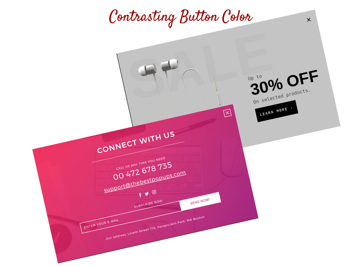
- Use contrasting button colors: Make sure your CTA button stands out. And a simple way of ensuring that is by giving the CTA a color that completely contrasts the body of the popup. Below are some good WordPress popup designs having contrasting CTA buttons:
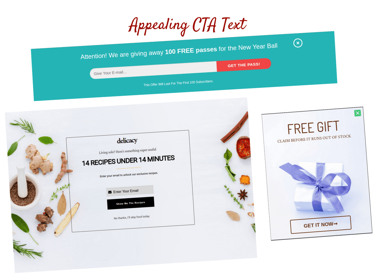
- Make button text appealing: If you only have one CTA button, make it sound as action-oriented as possible. Use positive words like:
- Get This Now
- Begin Download
- Reserve My Seat
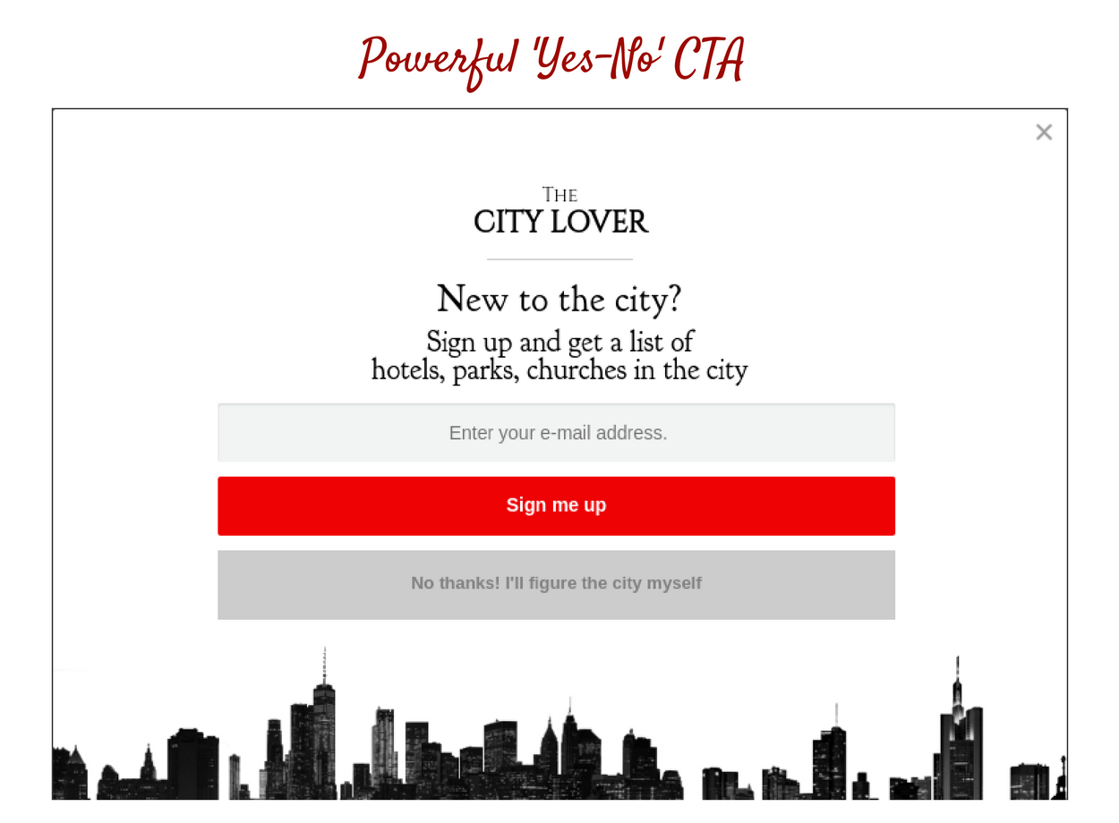
In case, you have two CTA buttons that are a ‘YES’ as well as a ‘NO’, you must make the text on the NO button sound very regretful. This will make the reader think twice before clicking on the No button.
- No, I don’t like offers
- Nah, Not interested in traffic
- No, I want to let this go!
- Leverage psychological triggers
You can do this by incorporating scarcity and urgency tactics in your CTA. This can be done through countdown timers or limited-time offers to boost urgent action. You can also use FOMO actions such as ‘Only 3 spots left’ or ‘Offers end soon’. - Testing and optimization
You can run A/B testing to compare different button sizes, buttons, text variations, and placements. Continuous testing helps you identify what works for your brand, what doesn’t and the areas of improvement going forward. - The right size
Make sure that your popups are large enough to be noticed but don’t overwhelm or interrupt the reader. Small popups may get overlooked while the bigger ones might feel too pushy.
Focus On The Typography

Which text was easier to read? Of course, it was Text 2. Why?
Because – it did not stress your eyes. One glance and you knew the word in the picture was ‘Flourish’.
Strategy:
The above example clearly proves, why typography is extremely important when it comes to convincing customers.
- If the font used in your WordPress popup is unreadable, the customer won’t attempt to understand it.
- So it is very very important to pay attention to the typography you use in your popups.
- Use Google Fonts. You can type in your sentence and check how it looks. Once you are sure about which font you like, use it in your popup.
- If you are an Icegram Engage user, and you wish to change the default font. Here’s how to do it in under 5 minutes.
Decide The Position Of The Close Button
Yes, the close button can also be a factor that increases the click-through rates of your popup.
Wondering how?
Strategy:
- Make the close button difficult to click view As shown in the example below, the close button is kept at the extreme top right corner. Making it very difficult to spot. So reducing the possibility of the viewer blindly closing the popup.
- Replacing the close button with a negative CTA button or secondary text
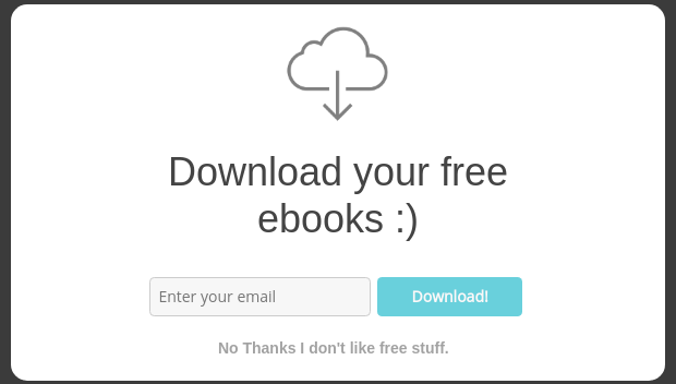
In this example, there is no close button. Instead, you have negative secondary text -‘ No thanks I don’t like free stuff’ which when clicked closes the popup. Now as the negative text is guilt-inducing, a reader thinks twice before clicking on it. Instead, he is pushed to give his email id and end-up downloading the free ebooks instead.
- Replacing the close button with a negative CTA button or secondary text
- Eliminating the close button completely
This strategy may sound a bit pushy. The reader is given no option but to click on the desired CTA. Here’s an example of how this strategy can be implemented.
- Eliminating the close button completely
Download e-books popup
- Close button proximity
Keeping the close button in the top right corner is standard, but placing it too far away can frustrate users. A well-placed button will prevent accidental exits and won’t disrupt the user experience. Place the close button inside the popup frame to make it visible and less tempting to click. - Test different close buttons
You can consider using a subtle but visible alternative. You can also try to experiment with subtle and fading options or reduce the contrasts to ensure that they are still accessible. - Experiment with texts
Instead of using texts, some popups use texts such as ‘not interested’ or ‘remind me later’. This leads the visitor to put in more thought before quitting. - Sliding or fading popups
Instead of a popup flashing on the screen abruptly, you can try one that slides on the screen and fades away when closed. Not only will this improve the user experience, but will also reduce intrusiveness.
Pick aesthetics images
An image acts as an anchor in your popup. It’s no surprise that, even if your popup is well designed but the image used in it is mediocre, there are high chances that it might fail.
Similarly, even if you have a simple popup with an aesthetic image, it might just work.
Strategy:
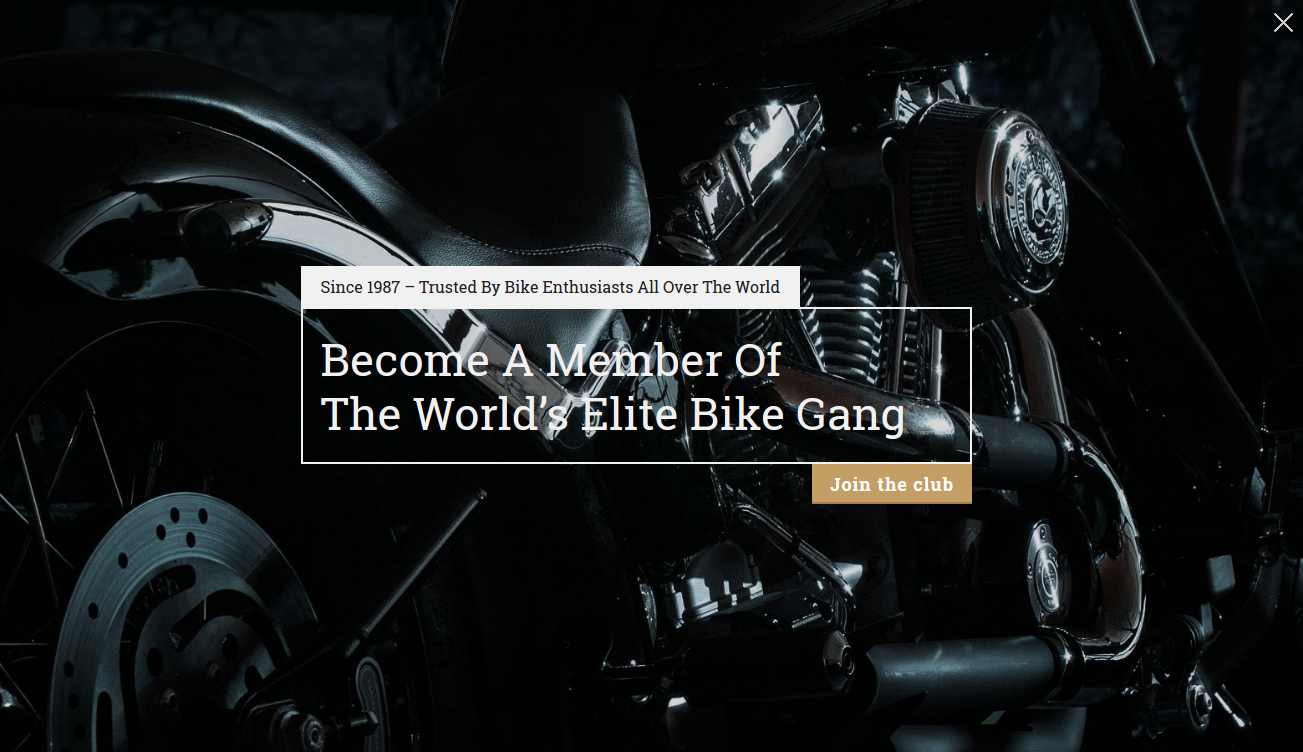
Use images that gain instant attention. Something with a pleasant background, and attractive people is a common strategy used by many. Checkout this example:

Include Your Brand
It’s important to blend your WordPress popup design with the rest of your website. The reason is, it should look like a part of your website. If it doesn’t, visitors will assume it’s some spam and simply close the popup or abandon your website. If you’re looking to improve the design of your website’s pop-ups, there are a few quick ways to do so in just 5 minutes.
First, consider the placement of your pop-up. A well-placed pop-up can be highly effective at converting visitors, but a poorly placed one can be annoying and drive people away. You should also pay attention to the design and layout of your pop-up, making sure it is visually appealing and easy to understand
Strategy:
Keep in mind the brand colour, and brand logo while making your WordPress popup design template. Suppose your brand colour is blue and yellow, you can design a popup having a similar colour scheme.
A few examples are listed below-
More Designs From Icegram Engage’s Gallery

Like these designs? Another way to improve your pop-up design is to use engaging and persuasive copy, highlighting the benefits of taking the desired action. Additionally, using compelling images or videos can also help to grab the attention of visitors and improve the effectiveness of your pop-up.
Finally, testing different designs and layouts can help you determine which ones are most effective at converting visitors. Get them within Icegram Engage’s Gallery
It’s Your Turn
When done right, popups can change the results of your sales funnel. From CTAs to images and typography, all these aspects play a key role in boosting conversions.
Now that you know about the things that can make a difference, why not put them to the test?
Try them, track your results, make tweaks if necessary and see the difference in engagement.
If you’ve already implemented these strategies, let us know in the comments below.
And yes, if you are looking for a popup that can do the heavy lifting for you, check out Icegram Engages’ light pricing plans.
FAQs
- How do I trigger a pop-up in WordPress?
With Icegram Engage, you can trigger pop-ups using a variety of options. You can trigger them based on user behavior, such as scrolling or clicking on a specific link, or on a time delay. You can also trigger them based on user location, device, or referral source. - Which Is the Best WordPress Popup Plugin?
Icegram Engage is a highly recommended WordPress popup plugin due to its powerful features, user-friendly interface, and affordable pricing. It offers a free version with basic features and several premium plans that provide additional functionality, such as advanced targeting and A/B testing. - Can I use popups without annoying my website visitors?
Yes, you can use pop-ups without annoying your website visitors. The key is to use them strategically and make them relevant to your visitors’ needs. Icegram Engage allows you to create pop-ups that are targeted to specific user groups and show them at the right time and place, which can make them less intrusive and more effective. - How can I make my WordPress popups mobile-friendly?
To make your WordPress pop-ups mobile-friendly, you can use responsive templates that adjust to different screen sizes. Icegram Engage offers a range of mobile-friendly templates that are optimized for different devices, as well as targeting options that allow you to show pop-ups only on mobile devices or specific screen sizes. Additionally, you can customize your pop-ups’ design and content to make them more mobile-friendly, such as using shorter headlines and calls to action.
Great post, thanks for share it.
Thank you for your kind words 🙂 Glad you liked it.
Wow, awesome guide to pop up design. This is one of the best guide so far.
Thanks
Can u tell me how can I open the popup by clicking on any text in website?
Hi Komal,
Please check this to open popup by clicking any text in website – How to Trigger Icegram Messages On Button or Link Click
Try it and let me know how it goes for you 🙂
where do I find the subscriber list if I am using icegram popup for subscription?
You need to use a mailing list system or our Rainmaker plugin to store subscribers. You can use our free Email Subscribers plugin, or a third party mailing list service – like MailChimp. Your subscribers will get added to the service you use.