We’re excited to announce that we have evolved our design to better meet the needs of our customers.
Icegram Express has a brand-new look and we know you’re going to love it as much as we do!
We have made these changes to improve the user experience, enhance the functionality, and increase the overall value of our product
Just like that, we believe this redesign will bring new value to your Icegram Express experience. Here are a few challenges that pushed us toward this decision:
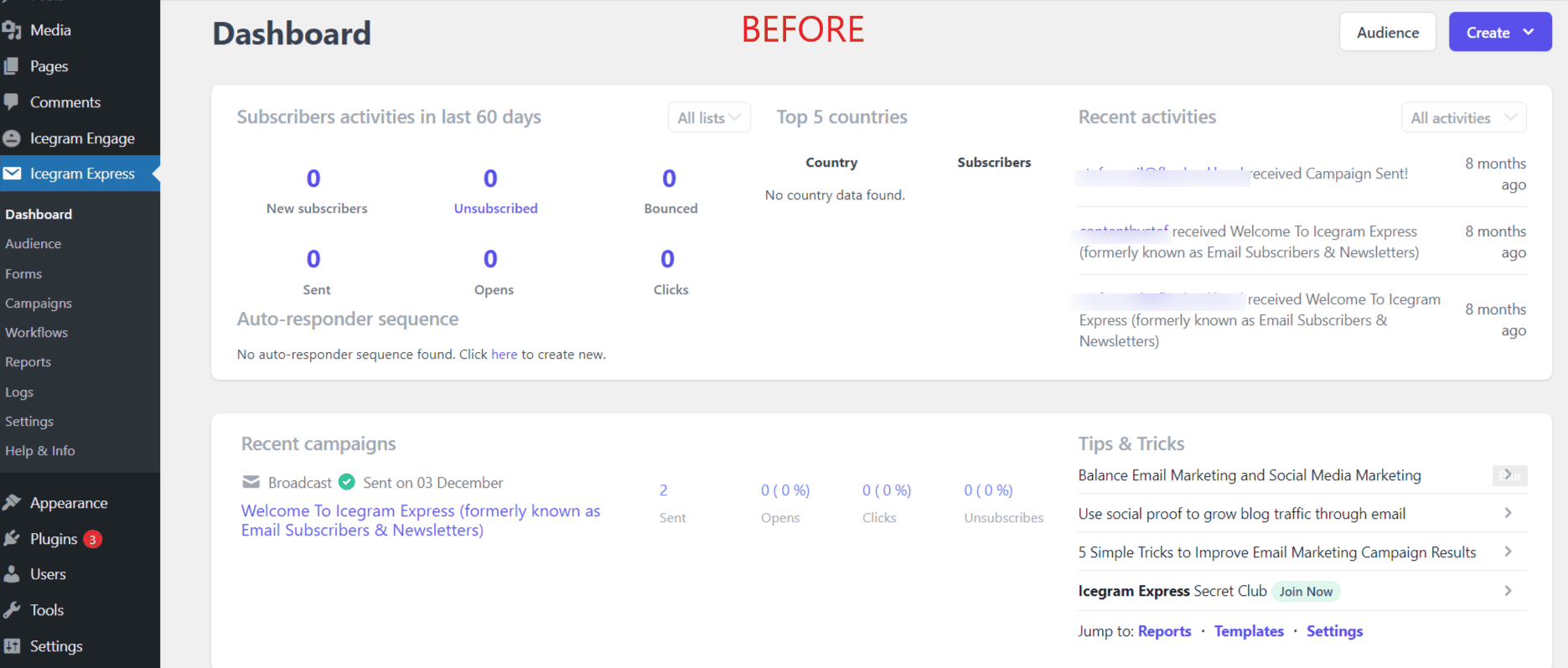
- Clarity: The previous interface was a bit cluttered, making it challenging for new users to navigate the platform.
- Functionality: Icegram Express has all the features needed to run your own email marketing system and now we have improved it in an even more accessible design.
- Appeal: It’s essential that our platform is not just functional, but also visually pleasing. And, we sensed an improvement was needed in this department.
But don’t worry, we’ve retained all those features you loved in the first version. We’ve just made them better, more intuitive, and pleasing to the eye. You see, sometimes, change is indeed a good thing!
A new look for Icegram Express
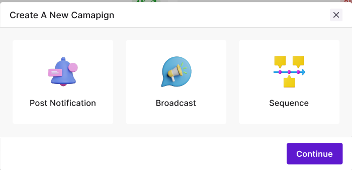
At Icegram, we are always seeking ways to improve user experience. And that’s why our team has embarked on redesigning the campaign creation flow in the plugin.
This new design is not just about aesthetics – it’s about making things more user-friendly and addressing the challenges you’ve been facing.
Why a redesign?

The need for a redesign was evident. Taking into account our users’ growing needs and solving the challenges they were facing, we created a solution. Fresh looks, combined with UX and UI enhancements, seemed to be the most effective approach.
It’s essential to draw attention to the fact that, while we’re introducing a new look, we’ve retained all the features you loved in the first version.

We’ve not removed it but improved it. The old version served its purpose, but we’re confident this new design will serve you even better.

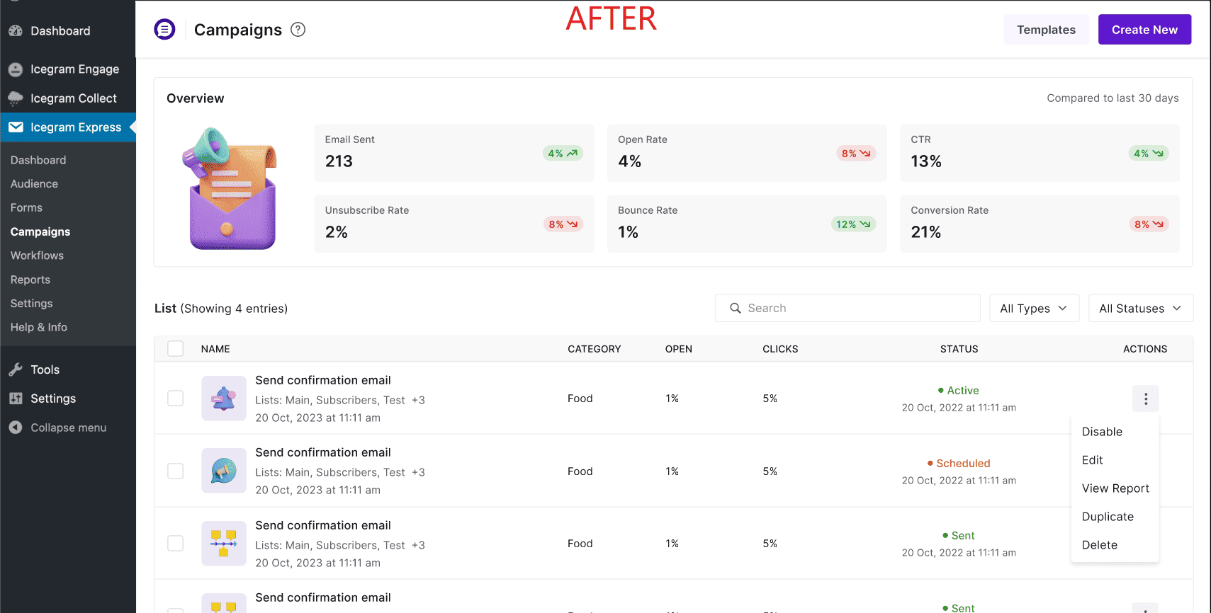
- A new KPI dashboard for better insights into your campaigns
- A more colorful and stylish interface for a pleasurable user experience
- Enhanced UX and UI elements for improved user-friendliness
What’s in it for you?
This redesign is far from selfish; it’s all about you, the users. With these changes, you’ll find the campaign creation flow more efficient and user-friendly. And of course, there’s the aesthetic upgrade – who doesn’t like working with a tool that’s not just functional, but also good-looking?
Your feedback matters
And as we finalize this redesign, we’re eager to hear from you. Once we release the new design, we’ll provide screenshots and documentation so you can explore and provide your invaluable feedback. After all, we’re making these changes for you, and who better tell us if we’re on the right track?
So, brace yourself for the new look of Icegram Express – a refreshing blend of style, user-friendliness, and functionality. Remember, sometimes change is indeed a good thing!
Check out the new look of Icegram Express and see how it can help you improve your email marketing campaigns.

