May has been a laser-focused month at Icegram Engage. Instead of just fixing issues and working on the look and feel of Icegram Engage, the team has been at work creating something more concrete.
We are excited to introduce to you, not one but two new features in Icegram Engage. Yes, we have added:
- Welcome Overlay
- Yes / No CTA
Let’s check out more about what the features can help you with.
Welcome Overlay
Welcome Overlays are also called Welcome Mats. These are overlays that show up as soon as the visitor lands on your website. That is, Welcome Overlays are triggered at zero seconds.
This message type inserts itself right above the site’s content. Thus, it’s the first thing a visitor views when they land on your webpage.
Proof they work
Here’s the proof.
Major marketers like Neil Patel, and Jeff Bulas along with top companies such as Uber, Spotify and others use Welcome Overlays.
And this is not a mere coincidence.
They use it because it simply works.
Let’s find out why Welcome Overlays work so well.
- Intelligent placement: Welcome Overlays are the first thing your visitors view when they land on the website. As a visitor has just landed on your website, he’s attention span is at the peak and any information shown during this time is bound to make an impact on him.
- Doesn’t block site content: Unlike the basic Overlay, the Welcome Overlay places itself above the website content, thus not blocking visitors’ view in any sense.
- Less annoying: Most visitors term popups, and overlays as annoying as they block them from viewing site content. As Welcome Overlays are placed above the content they come across as non-annoying.
Top 5 Best Uses Of A Welcome Overlay
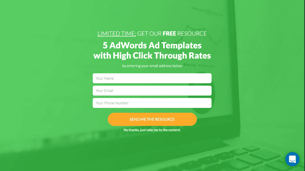
Give visitors a resource
Welcome Overlays are an excellent mechanism for winning over visitors in the first go. Providing them with a valuable resource will please visitors and keep them interested in your site.
Distribute early bird access
Early bird access is generally limited to a few hundred or thousands. Welcome overlays help in inducing urgency in such time-limited offers.
Offer discounts
Running an offer on your store? Show it in a Welcome Overlay. Make visitors aware of the offer as soon as they land on your website. This technique will reduce bounce rates and keep them interested for longer.
Build your subscriber list
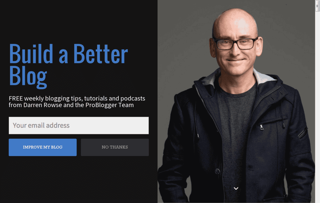
Convince visitors to join your list as soon as they land on your website. Putting a personal picture of you will only increase relatability and help you grow this list faster.
Direct them to the most important page on your site
Direct visitors to the most important page on your site. In the above case, it’s the blog. You may choose to direct visitors to a new article, the shop page, or any other page according to your requirements.
Try the Welcome Overlay on your website
It’s your turn to experience the magic of Welcome Overlays on your website. So go right now and set up a Welcome Overlay of your choice using Icegram Engage.
Where to find the Welcome Overlay?
It’s located right above the Headline Generator.
The new feature of Welcome Overlays is only present in Icegram Engage Max plan.
Moving forward…
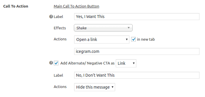
The next feature added is the Yes-No CTA buttons
Initially, Icegram Engage only provided one CTA button for any message type. However, we ran a survey and realized that high-performing campaigns usually have two and not just one CTA.
That’s when we decided to add this feature to Icegram Engage.
You can locate it inside Icegram Engage’s campaign editing panel.
Note: The Yes-No CTA button is available in the Pro plan and above. Also, it can be added to any message type that allows the insertion of buttons.
Want to use the Yes – No CTA buttons? Get the Icegram Engage Pro Plan today!
What makes Yes-No CTA so appealing?
Yes – No CTA’s can be really powerful if used in the right manner. When a visitor reads a message having a Yes – No CTA they automatically decide in his mind.
You may argue that the visitor makes a decision even when there is only one CTA button, right?
Yes, he does. But in case of a Yes and No CTA, you have the power to reinforce and test the visitor’s decision.
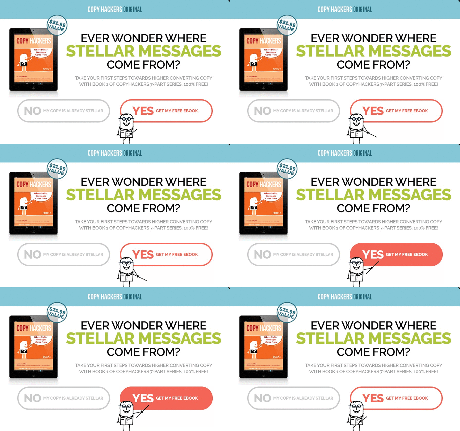
How? By making the Yes CTA text more appealing and the No CTA text more regretful.
One such example is shown in the image above. Here’s another example:
Still in doubt about the effectiveness of Yes – No CTA buttons? I suggest to try it out yourself.
FAQs
- Q: What plans offer these features?
The Welcome Mat is available in the Max Plan, while the Yes-No CTA Buttons are part of the Pro Plan and above. - Q: Do these features work on mobile?
Yes, both are mobile-friendly and adapt seamlessly to different screen sizes. - Q: Can I customize the messages?
Absolutely! You can tailor the text, design, and behavior to fit your brand and audience.


